Disclaimer : I care and because I want to.
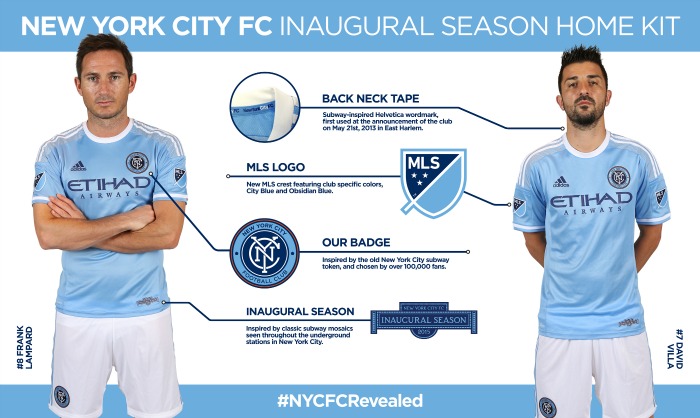
New York City FC home
![]()
In a nutshell : boring, not terrible.
 The kit feels like it falls out of a catalogue with noticeable exceptions on the sleeves where the colour coded MLS badges will be affixed. That may be standard but they seek to be new. For all of the iconography NYCFC have at their disposal, it’s a shame the didn’t co-op any of it. It may be cliché, but you just have to pick one. Something embossed into the fabric like the interlocking initials or the new World Trade Center or the city crest. The white trim is a crime given the navy blue throughout the sponsor and manufacturer. Navy cuffs and collar would have stepped up the class.
Get if : gotta have them all, sitting with the home supporters, like things that won’t draw much attention to you.
New York City FC away
![]()
In a nutshell : boring with no effort whatsoever
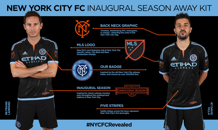 The blue trim is ok. Not a fan of the orange cut at the bottom of the collar, but it is easily overlooked for the black base and the absurd five slightly diagonal stripes. I can think of a dozen better ways of representing the five boroughs than this weak look. The sponsors will be pleased as the eyes immediately are drawn to it. Adidas had the wherewithal to include the interlocking initials but stuck on on the back of the neck. Best part of the badge put in a terrible position. And black? Really? Not the navy blue? The one in your brand new badge? How about a navy kit with a black band and put the sponsor in there. Shame about the orange in that it is best used on the new MLS team-branded badges.
Get if : you like being a billboard more than other supporters of clubs, think that black goes with everything, really hate sky blue.
Leave a Reply