Disclaimer : I care and because I want to.
![]() for the Giovinco outfit
for the Giovinco outfit
![]() for the Bradley/Altidore outfit
for the Bradley/Altidore outfit
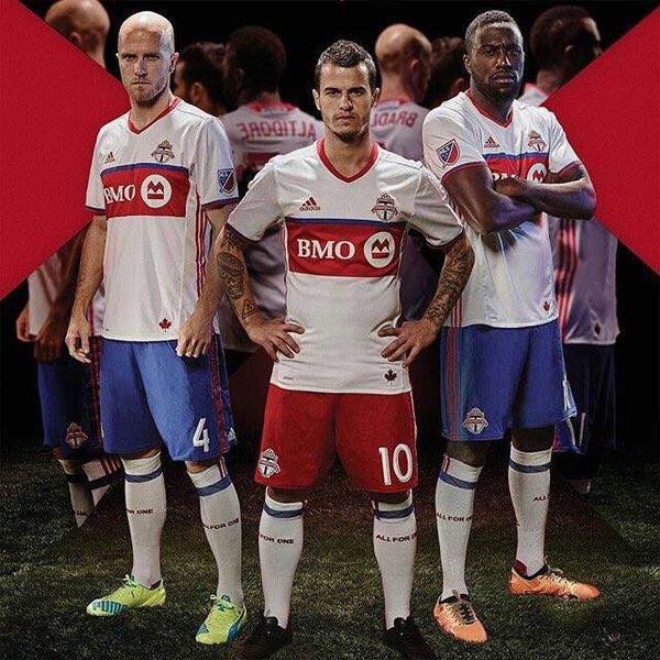
In a nutshell : White with a large red horizontal band and a smaller blue band above it
The inside collar says : unknown
The outside back collar has : “All For One”
The jock tag position has : a maple leaf, because we’re Canadian, unlike Vancouver or Montreal
The side Adidas stripes are : red 
Well, that was underwhelming.
We had heard through the grapevine, that the away kit was going to be predominantly white. So that was correct.
Then there was the hint that a “non-traditional TFC colour was going to be incorporated”. Factual, sure.
Then there was the old-timey TV promotional spot to hype the launch. OK, sweet, so it was going to look like the Blizzard. Or Metros-Croatia. Probably not vanilla Metros (but one can dream).
The jersey is white with a red horizontal band across the chest and a thin blue stripe above it. Red shallow V-neck and red and blue trim cuffs. I really dig the cuffs, simple with equal weight for the blue and red. From the images and video, not much in the way of details of the shirt, which I’m sure will come out in the coming days.
So the homage to the past is not, in fact, an homage
whatsoever, as no modern Toronto soccer team ever had a look close to this. Guess having blue in the kit is a metaphorical bone thrown to the 15 people who follow Toronto FC who once attended a Blizzard match as a child.
I don’t fear blue for this team, even as trim, and it should never have been discounted as part of the identity. The Blizzard had blue in their uniforms and they were a red team. I’ve always felt Toronto was a “blue” city, and that their soccer team omitted it was a mistake (thank you branding and marketing). Don’t get me started over the basketball team…
So all things being fair and equal, though the shirts are kinda simple given all that’s on offer from the rest of the league. However, the full kit is where it gets kinda nice.
The more I look at the full uniform with the blue shorts with red stripes, the more I feel they got the look right. Still not much of a throwback, but this is much closer to what I would want out of a Toronto kit. Not necessarily a Toronto FC kit, but a Toronto kit. Representing the city of Toronto. This makes me happy, and makes an otherwise ordinary shirt look very nice.
Also, red away shorts? Compared to red home shorts? Really? I know the difference being the adidas stripes, but really? It’s an away kit. A change kit. There isn’t much change, is there?
Note 1 : could be the only time ever Bradley and Altidore are rated over Giovinco
Note 2 : way to go internet! You leaked almost the rest of the league except this one.
Get if you : are ordering the blue shorts too, buy-in that this is a proper throwback/homage to the teams of the past.
Leave a Reply