Disclaimer : I care and because I want to.
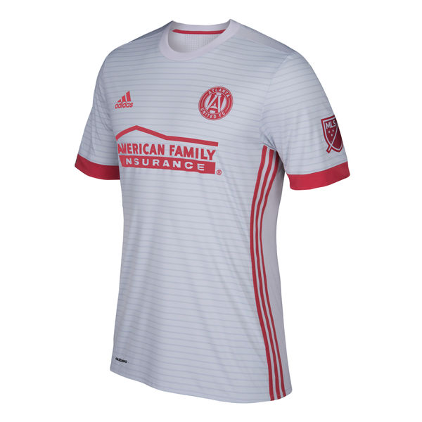
Atlanta away
![]()
In a nutshell : It’s a solid away kit.
The inside collar says : none
The outside back collar has : Atlanta United
The jock tag position has : none
The sleeve has : ATL UTD
Compared to previous kit : best ever (first one)
Sometimes tweaks to a template is a good thing, especially when you’re trying to establish your visual look and identity. This kit has two colours only : red and grey. It’s a grey shirt with horizontal pinstripes with a ringer collar, red cuffs, red side Adidas striping from armpit to hip.
Some people have issue with sponsors, and sometimes I do, but I’m ok with it if they play along. And the sponsor here does. The Adidas logo, the sponsor, and the badge is all red. It’s a tidy bit of kit. Far from a classic, but it’s nice and casual.
Get if you : enjoy nice looking grey kits, like pinstripe hoops done well
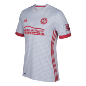
Houston home
![]()
In a nutshell : Still orange, still using the terrible blue as an accent.
The outside back collar has : Forever Orange
The jock tag position has : State flag of Texas
Compared to previous kit : A bit lateral
The shirt is orange with an orange ringer collar, with stupid light blue pinstripes through the front of the shirt, white Adidas top of shoulder striping, white cuffs with a stupid light blue pinstripe.
Two things that irk me about this, the co-opting of the flag of Texas and not using that dark brown within the badge. First off, much like Toronto co-opting the national symbol for an, at best, regional club, using a state symbol given that there’s another team in the state is a bit desperate. Secondly, brown goes with orange better than stupid light blue. Lean on that more, Adidas.
Get if you : didn’t like gradients but love weird coloured horizontal pinstripes.
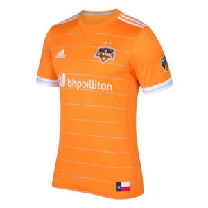
Orlando home
![]()
In a nutshell : it’s still purple with noise in the background
The outside back collar has : Orlando City with a sunrise icon
The jock tag position has : Lion head secondary logo
The sleeve has : 28.5410645°N 081.3890350°W
Compared to previous kit : It’s too close to call.
This isn’t bad.
The purple heathering throughout the fabric gives it a casual feel. Looks more like a club golf shirt than a kit, especially with the purple button collar. Peanut butter brown shoulder stripes, white Adidas markings, sponsor, latitude and longitude markings on the right cuff.
It’s oddly plain, and that’s not necessarily a negative. It kinda works in it’s simplicity and lets the heathered background do all the heavy lifting.
Get if you : like your kits to look like you’re golfing, have a sweet pair of purple jeans that need a shirt, have a sweet pair of khakis that need a shirt.
Leave a Reply