Disclaimer : I care and because I want to.
Sporting KC home
![]()
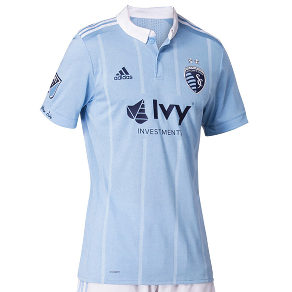
In a nutshell : Why does a team I hate have kits I like? ANSWER ME UNIVERSE!!!
The sleeve has : No other club
Compared to previous kit : Much much better
Well, we’ve come a bit of a way forward from the graph paper look of last season.
The shirt is sky blue with four slightly lighter sky blue thin stripes on the front of the kit, sky blue sleeves and cuffs, white button up collar and white top of shoulder Adidas stripes. No stupid jock tag. No stupid collar slogan (that I could find). It’s really nice.
It appears that they’ve swapped the sky blue with navy with NYCFC for the sky blue with white. Hope there was some allocation money in the trade.
I’m on the fence with the stripes. Some pictures, the stripes look great and in others they look forced, tacky and almost iron-on. Without being able to hold it in my hands (anyone? Adidas?) I’m leaning towards “it’s ok, and just an unfortunate angle/photograph”.
Get if you : like stripes, like classy kits with a nice collar, really thought the graph paper look from last season was bad.
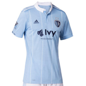
NYCFC home
![]()
In a nutshell : Still sky blue but swapped white trim for navy trim.
The inside collar says : List of the five boroughs
The jock tag position has : Civic flag of New York City
The sleeve has : an orange pinstripe
Compared to previous kit : Better
This is probably the home kit they should’ve had last season, but what do I know. White as an accent to light blue doesn’t do the light blue favours as it just washes out the colour further. Given how much it factors into their branding, this offering feels like a correction.
Light blue kit with navy v-neck collar, navy Adidas top of shoulder striping, navy cuffs with orange pinstripe. I do appreciate seeing the New York City flag as the jock tag.
Get if you : held out for something better than last year’s kit.
New England away
![]()
In a nutshell : half and half!
The outside back collar has : Flag of New England
The jock tag position has : Flag of USA
The sleeve has : Est. 1996
Compared to previous kit : improvement
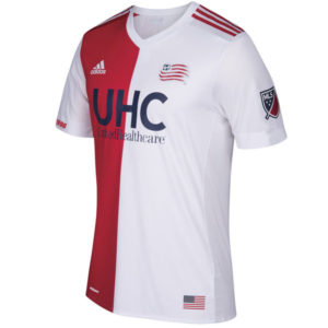
I saw what you did with the kit last year that looked like Christmas. A for effort, but execution was lacking.
This one looks great. Looks like something straight out of a 100-year old club from Switzerland. It’s meant to be a white kit (the back is all white – that’s how you know), with red trim. White v-neck collar, white sleeves with white cuffs. The front is half red (with white Adidas top of shoulder stripes) on the right side, white with red striping on the left. It’s totally sharp. The sponsor plays along a bit with navy text, and doesn’t look out of place.
The shorts are red (not pictured) but it’s important because as a shirt on it’s own, it’s nice. But as part of a full kit, it’s sharp.
Get if you : secretly wished for a kit like Feynoord Rotterdam, like a classic half/half kit
Leave a Reply