
Disclaimer : I care and because I want to.
![]()
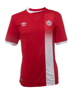
In a nutshell : Red with a weird collar and an off-center vertical white stripe
One of the things that usually trouble kit designs of national teams is the concept of tradition. One of my favourite misconceptions is that Canada should always and only wear red and white because “flag”. Not that you can’t do great designs with only two colours, but it then limits what you can actually do if you adhere to this. Finding ‘new and exciting ways’ to add design to a kit can be troublesome and risk being repetitive.
I only mention this because, personally, I’m not averse to adding other colours. Canada should always be predominantly red.
In the recent past, I didn’t mind the template black and white chevron on the red kit. I really loved the imprinted hoops. The last kit was a little ordinary but far from poor. Now we have vertical stripe below the badge with a halftone fade.
Bias alert, I adore the usage of halftones.
From a distance, it’s a kinda sharp kit. Clean lines for the white stripe, white cuffs, obligatory Canada flag below the collar on the back. Oh, the collar… it’s half white on one side, half red on the other, and the red overlaps the white part at the centre of the collar on the front. I’m not crazy about it, but I don’t completely hate it. I feel as if this collar would’ve been better served if the red part of the collar was a third colour (black, silver, maroon, even the blue from the centenary kits). It looks lopsided to have this half white collar, because that’s the first thing my eye registers when looking at it as the red half blends into the shirt.
Another thing I’m not that crazy about is that the stripe is it’s own fabric panel on the kit. I’m sure there’s as much of a manufacturing issue as much as a design issue, but looking at the promo shots, the fabric of the white stripe/badge panel appears shinier than the other. Until I’m holding one in my hand, I’ll assume a slight difference between the white and red panels.
It’s fundamentally different than any Canada kit in the past, and Umbro trying to give Canada something bespoke is nice. I know we all expect Canada to be a two-tone thing, but it’s not bad to dip into a little more from time to time. And don’t give me crap about “tradition” and “national colours” since Japan, Australia, New Zealand, the Netherlands, Venezuela, Italy, Russia (yeah, it counts), and Germany (you really going to count the trim?) step away from the colours in their flags for their national team kits, I’m fine with it.
Get if you : want something more than “just” a red shirt, didn’t think the last kit was anything to get excited about.
Leave a Reply to Trillium Cancel reply