
Disclaimer : I care and because I want to.
![]()
In a nutshell : The white band is back, baby!
The inside collar says : Live Red (very faintly)
The outside back collar has : crossed hammers
The jock tag position has : embossed flag of Chicago
The side Adidas stripes are : navy 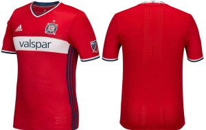
If you’re going to stick your neck out with crazy patterns and absurd colour schemes, be careful. Sometimes, it works and sometimes, it doesn’t, but most often, it’s change for change’s sake.
Chicago, for much of their history had the white band across the chest on a red shirt. Then, change for change’s sake happened and the white band was replaced with a navy band, then that sky blue gradient thingie from last season (source).
Well, it’s back. It’s simple. And it’s fantastic. It’s a proper kit in, what I identify as, what Chicago is supposed to look like : red shirt with a single white horizontal band. Shallow V-neck and cuffs with both white and navy trim, classy embossed civic flag near the bottom of the shirt, navy Adidas side stripes. The sponsor, I may be crazy, looks almost smaller than it could be. I’m chalking that up to some kind of optical illusion I’m not getting. It almost looks like a throwback, but Chicago never had anything this plain to recall from history. It looks more like something you’d see in Europe not in the United States.
This could very well be the quintessential Chicago Fire kit.
Get if you : want to make sure you never need to buy another Fire kit as long as you live.
Leave a Reply