Disclaimer : I care and because I want to.
Columbus Crew home and away
![]()
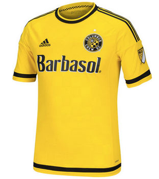
 Columbus could have had it so much easier than this. As a bias towards football’s black and yellow, I’ve oft been disappointed with the offerings the pseudo-rivals have offered. There was that ‘stripey sports bra’ look, which was approved by many people without tastes in suits no doubt, which went from boring to terrible, a first from the club.
But then they got a makeover. Gone were the vestiges of terrible Nike’s 90 marketing, and enter in respectability with a new badge. And a new badge comes new kits.
Checker embossed, the home and away are the inverse of one another, usage of a simple element of the badge in the pattern of the fabric. A different set of cuffs with the two-tone trim than that of the rest of the league’s debutant kits. Sponsor matches logo with colour scheme.
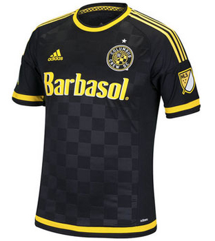 Away kit isn’t white.
Quite possibly, the new champion home and away kit set. I openly admit that this score is influenced by my affinity to the colour scheme… so it’s probably a 3 out of 5.
Get if : you like checkers, you like progress, you like simplicity, you like a classic looking kit.
Leave a Reply