
Disclaimer : I care and because I want to.
![]()
In a nutshell : Still barely worthy of being called “the hoops”
The inside collar says : “Dallas ‘Til I Die”
The outside back collar has : modified version of the flag of Dallas
The jock tag position has : Flag of the United States
The side Adidas stripes are : white 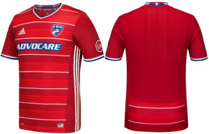
Oh my FC Dallas (longtime podcast listeners will understand this). How did you screw this up?
You rebranded after being the Dallas Burn. You bestowed upon yourself red and white hoops. You succeeded as the club’s nickname became “the hoops”. Then the last home kit, you sublimated the hoops into the fabric. So your colours were red and slightly darker red hoops.
Now you’ve managed to add a white pinstripe to the mix of red and slightly darker red hoops.
As a shirt on it’s own, it’s not bad and, to be fair, an improvement on the previous home kit. Relatively clean look. Red shallow-V neck collar, white and blue cuffs, red everywhere else with the exception of the white horizontal pinstripes. The shorts are white with red stripes and blue trim around the leg cuffs, which actually look nice. Red socks with white pinstripes. A weird side-effect is that the sponsor doesn’t look all that bad as, at a quick glance, it could pass as part of the trim. In some of the promo shots, at least aesthetically, it looks good.
So you’re really not the hoops. You’re the southern reds.
What the hell? Why? Just make a red version of the very nice away blue one and it’s a simple 5 out of 5, because that is a perfectly fine kit.
For what it’s worth, I really wanted to score this a 2 out of 5, because it’s barely hoops. And this league needs more hoops and stripes in their kits. It feels like some of the variety is being lost with basic looks for some unknown reason. That being said, it’s acknowledging that outright bias for stripes and hoops that I’ll give it the mark it deserves, stand alone. It’s not terrible, by any stretch. Just not what I was hoping for.
Hey, TFC… hoops look to be available for next season… #justSayin’
Get if you : need to get a home kit but refused last years, like horizontal pinstripes
Leave a Reply