Disclaimer : I care and because I want to.
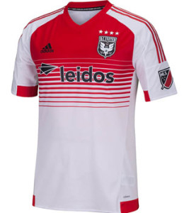
DC United away
In a nutshell : new  Adidas template that throws subtlety out the window
Over the years, DC United has been bland with their away kit : just the inverse of the black kit. A few years back, they blew minds by offering a 3rd kit that was red(!). The world reeled in shock. After parting ways with that one-off red kit, someone had the brainwave of only half bringing it back.
And here it is. Red on top, white on the bottom. The sponsor gets a little lost on the front of the kit due to the richness of the red, which really isn’t that bad. It’s not terrible, but it isn’t exactly great. Or that good. It just feels like a good idea on paper, but a misuse of the horizontal striping (unlike that on the Galaxy away kit) just seems like it’s loud for loud’s sake.
Get if : You’re over the often-classy home kit, you want something that looks ‘more Polish’

Leave a Reply