Disclaimer : I care and because I want to.
![]()
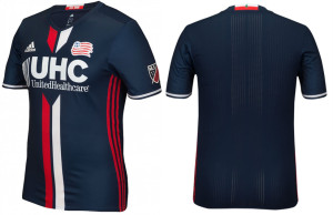
In a nutshell : It’s navy with two big stripes down the middle.
The inside collar says : “Est. 1996”
The outside back collar has : tree from the flag of New England over a white and red stripe
The jock tag position has : nothing (at the time of publishing that I could see)
The side Adidas stripes are : red 
The team with the dodgiest badge in the league has debuted their second nice home kit in a row.
The shirt is navy all over with two thick stripes down the centre, red on the right, white on the left, with a slight gap in between them. There is a break in the stripes for the sponsor (naturally). White trim on the cuffs, no trim on the shallow V-neck (which looks sharp), and red side stripes. This is the second kit of the new releases where the design came from somewhere else. Not everything can be original, nor needs to be, even if its a little Paris St. Germain-esque circa 2014/15.
This could be the images of the shirt or the optical illusion of the break in the stripes, but the sponsor looks massive on the front.
I couldn’t call it a classic, but it’s far from terrible.
Get if you : didn’t like last year’s kit for some reason

Leave a Reply to zicogold Cancel reply