Disclaimer : I care and because I want to.
![]()
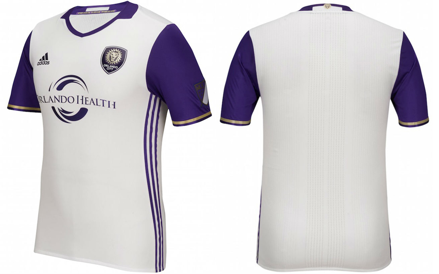
In a nutshell : Purple sleeves with a white shirt.
The inside collar says : “Defy Expectations / Superando Las Expectivas”
The outside back collar has : the lion from the badge
The jock tag position has : nothing (yet…)
The side Adidas stripes are : purple 
Orlando City have done away with their ancient away kit and come up with this new one. I’ve always liked shirts where the sleeves and the body are different colours (I always thought this Toronto FC kit could’ve been the standard look). It looks sharp and old-timey as a look. This is also one of the times where having the Adidas stripes down the sides is a very good idea. I’m digging the small collar with the shallow-V neck combination that only a few teams are getting, but I’m having a hard time discerning if it’s an actual collar or part of the cut of the shirt (thanks released renderings!).
I still have problems with their peanut-butter gold colour and it still looks like a bad idea. Even though it only appears in the cuffs and the badge, it’s still too much. Lose a mark for the cuffs. And lose a mark for replacing a shirt after one year. This isn’t EPL, you know.
Get if you : like purple sleeves on things.
Leave a Reply