
Disclaimer : I care and because I want to.
![]()
In a nutshell : Gradient red and black hoops but doesn’t sound as bad as the description implies.
The inside collar says : “Rose City”
The outside back collar has : “No Pity”
The jock tag position has : crossed hand axes
The side Adidas stripes are : red 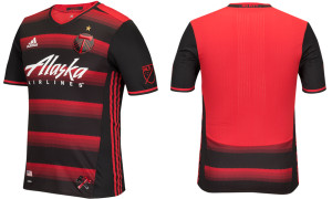
This one, I feel, is a bit of an optical illusion type of kit.
If you saw someone wearing this up close and you weren’t a bearded-hipster eating expensive free-range ironic artisan donuts (I know, stereotyping for a gag) who supports Portland, you might question that person’s judgement and/or moral compass. There’s details in those hoops, like their semi-obligatory nod to the “Rose City” with the thorn pattern adorning each band. And the details are nice – who doesn’t like their club to receive the custom not-so-template treatment – but up close, this shirt has a bit too much going on, no matter how well thought out it is.
However, if you were in Seattle watching Portland play (not a stereotyping gag) and the away team is in their away kit, as they should as both wear green, from a distance, you’d be looking at a stunner. Black sleeves with a red back for the nameplate and number, obligatory red stripes on the sides, obligatory shallow V-neck collar. The gradient’s effect will look a bit washed out, and that’s a good thing. From a distance, this will look like a very nice, very functional hooped kit.
The other remarkable note about this kit is it features a wordless badge. Missing are the words “Portland” and “Timbers”. During the off-season, the word markings have disappeared from their logo, which has spread to their website. It’s oddly bold and unorthodox in a sports-marketing realm, especially so for an MLS team. However, it works on the kit, in the red and black representation of their badge.
Get if you : want to impress someone across the street, want to forget last year’s gradient snoozer.
Leave a Reply to BigWullieStyle Cancel reply