Disclaimer : I care and because I want to.
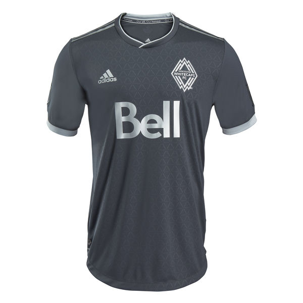
Vancouver Away
![]()
In a nutshell : dark and boring with lots of triangles
The inside collar says : Our all. Our honour.
The outside back collar has : a maple leaf. Because how else would anyone know they’re Canadian?
Compared to previous kit : it’s a giant sleepy step backwards

Triangles. (just let it run in the background)
So it’s black. Or really dark grey.
Grey/silver Adidas stripes on the shoulder, grey/silvery cuff trim on an all black(ish) kit. Revisionist “Since 1974” graphic appears on the socks. Ringer-sorta-v-neck collar with silver trim.
And then there’s the triangles. They really doubled down on the triangle motif from their home shirt. The sublimated pattern has a triangle pattern everywhere. According to this infographic, it symbolizes unity between the fans, players and the city.
Good.
Clearly there’s been some problems for YEARS between two of the three, off and on for some time and who else but the soccer team that lies about it’s actual history to bring the fans together with the players, who both need to be brought together by the city. You expect the Canucks to do that? Hell no, they’re part of the problem, I assume. Probably Trevor Linden’s fault.
Look, you can’t expect me to take the infographic seriously. And I can’t expect anyone else to take it seriously. And is the shirt black? Is it blueish-grey? Colour correction people. You can’t promote something looking like one thing and receiving another. That isn’t very unity when you lie to people. The shirt isn’t that bad, but the marketing makes it worse.
And as an aside, someone at Adidas or MLS needs a slap in the head for all of these black away kits. Seriously.
Get if you : love triangles, buy into infographic bullshit, hate fun.
NYCFC Away
![]()
In a nutshell : dark grey with some light blue
The outside back collar has : City
The jock tag position has : the interlocking NYC from the badge
Compared to previous kit : It sucks and it looks like a training top
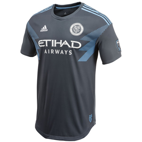
Wait, isn’t this Minnesota’s colours?
Regardless, this is a phoned in mess. It’s like someone had 3 months to firm up a design and realized 5 minutes before the deadline that they had to come up with something.
So it’s a dark grey kit everywhere, dark grey cuffs and ringer collar. Light blue Adidas stripes at the top of the shoulder, the advertising, badge and Adidas logo all appear in white, so the sponsors would like that. Then there’s the three blocks that appear from the seam of the cuff and the chest that come down on an angle towards the centre of the chest. Each block is made up of vertical stripes, getting thicker as the blocks descend.
It’s not a the pattern that upsets me, but rather that other teams who wear it will look far better and NYCFC could only do this.
Get if you : hate yourself, love boring, feel jerseys should be overpriced and you feel privileged to purchase anything on offer.
Portland Away
![]()
In a nutshell : It’s white.
The inside collar says : We’ll sing for you Timbers – ‘til you finish the fight!
The outside back collar has : Timbers
Compared to previous kit : Different, but nowhere near as interesting
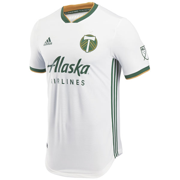
The previous away kit was the red and black gradient hooped kit. This is nothing like that. It’s the difference between a good Saturday night and a lovely Sunday afternoon.
The Timbers away kit falls back in line with their pallet, white kit, green v-neck collar with gold trim, white sleeves with green and gold trim, Adidas green striping along the sides. That’s it. No jock tag. No pattern in the shirt. Nothing wrong with that.
The long sleeve has thicker green cuffs, if you’re into that sort of thing.
It’s plain. If I was measuring these kits against what else has been released, it would be a 1, just due to lack of uniqueness and a touch of phoning it in. More obviously templated than some of the others on offer. It’s simple.
Get if you : like plain things.
Leave a Reply to Mark HSV Cancel reply