Disclaimer : I care and because I want to.
Minnesota home
![]()
In a nutshell : dark grey and light blue shouldn’t work together, but they do.
The inside collar says : nothing at time of publication
The outside back collar has : nothing at time of publication
The jock tag position has : nothing at time of publication
The sleeve has : nothing at time of publication
Compared to previous kit : best ever (first one)
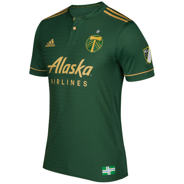
If Minnesota missed out on anything, is that their shirt designs appear to be based on last year’s models. It’s a dark grey kit with sky blue trim on the cuffs, sky blue Adidas stripes from armpit to hip and the half collar-half v-neck style from some of the kits issues last year.
The front of the shirt has a wide sky blue sash over a dark grey chest that runs from left shoulder to right hip. The contrast is nothing I’ve seen before. It works.
And then there’s Target. The primary sponsor is the Minnesota-based retail chain and they just went with the Target circular logo, without wordmark.
There’s an oddness to it as they’re the only sponsor in the league without words (you can put an asterisk next to New York Red Bulls). It just floats there. And it’s in white. It jumps out at you. I’d rather have seen the logo in black, but at least it’s not in red.
For a first kit, Minnesota did well for themselves.
Get if you : like a grey kit that isn’t an away shirt, like sashes, like a bullseye so people know where to hit you
Minnesota away
![]()
In a nutshell : very away kit-esque.
The inside collar says : nothing at time of publication
The outside back collar has : nothing at time of publication
The jock tag position has : nothing at time of publication
The sleeve has : nothing at time of publication
Compared to previous kit : best ever (first one)
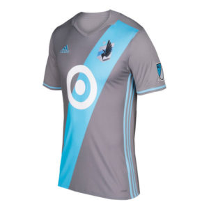
I suppose if your colour pallet is silver, black and sky blue, you don’t have many options to play with for an alternate.
The easiest cop-out would’ve been a sky-blue kit, but instead we have a predominantly white shirt that looks like a warm-up. The cut is more baseball style, so we have shoulders that are dark grey that goes half-way down the sleeve with sky-blue Adidas striping on top. White cuffs. Dark grey trim at the bottom of the shirt.
Unlike the home kit, the Target symbol is Black, no wordmark. If it wasn’t so template, I’d be more of a fan. It feels like they didn’t quite get the development cycle as Atlanta did, but it’s a first year kit and, for all intents and purposes, it’s respectable.
Get if you : need the complete set of Minnesota United kits
Portland home
![]()
In a nutshell : A perfect shirt you can be proud of for years (team performance notwithstanding)
The inside collar says : There’s a party in Portland, No one is sleeping Tonight
The outside back collar has : crossed axes
The jock tag position has : Civic flag of Portland
Compared to previous kit : This is what you’ve wanted
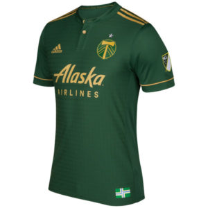
You wish your club had one this nice. Every club wishes they had one this nice.
They took the nice third kit from a few years ago, fixed it up, polish, gave it a shave and *bam!* a classic.
It’s an all green kit with gold trim. Gold top of should Adidas striping, gold trim on the green cuffs, gold buttons on the ringer collar. So many kits try to evoke an emotion with their supporters, but this one feels like they nailed it. If it had it’s own hipster beard and a microbrewery in the shorts (ok, that’s uncomfortably amusing ~ Ed.) it could be the official uniform of the city. Also, there’s a really nice criss-cross stitch pattern within the embossed fabric.
Also, the sponsor changed their logo. The wordmark for Alaska is much cleaner and less chaotic. It just adds to the class of this, and if the old wordmark was used, it would take it a notch down.
Get if you : want to wear the best looking new kit this season, love a nice collar on your shirt, like nice patterns in your fabric, want to make other kit nerds super jelly.
Leave a Reply