Disclaimer : I care and because I want to.
Chicago away
![]()
In a nutshell : windswept steel isn’t as boring as it sounds
The outside back collar has : Crossed hammers with a six-point star
The jock tag position has : Est. 1997
The sleeve has : the four red six-pointed stars from the civic flag
Compared to previous kit : an improvement
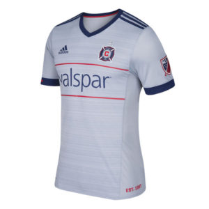
Anyone who really gets upset at away kits is missing the point. They’re a change kit. Ideally, you wear something else that doesn’t clash with the home side’s kit. When they’re bad, they epically bad, but I have a lowered expectation with them.
If this were a home kit, I’d probably think differently, but it’s not. Chicago’s away offering is grey with navy cuffs, navy v-neck collar, navy Adidas top of shoulder stripes and grey everything else. Red trim makes up the jock tag, and the line above and below the sponsor to carry over the “chest band” design that often comes with the Chicago home look and I appreciate that when looking at a whole team’s kits (home, away, 3rd) as a set.
The pattern on the chest looks like windswept steel or chrome. Really it’s a bunch of random horizontal stripes in slightly darker shades, but we’re trying to be kind. I’m not for or against this pattern.
Get if you : wanted something a bit more casual in your away day wardrobe, want an upgrade from last year’s away offering
NYRB home
![]()
In a nutshell : white shirt with lines.
The sleeve has : Love Fight Passion Glory
Compared to previous kit : A step backwards
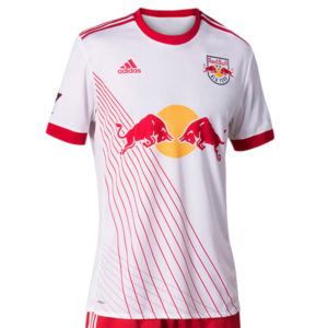
I already miss the red sleeves.
This is a predominantly white kit with a ringer red neck, red cuffs, red Adidas striping at the top of the shoulders. The body of the kit has this array of lines eminanting from the right armpit to the bottom of the shirt with an array of grey stripes behind the red ones to give a shadow effect. It’s almost awkward enough to forget there’s a giant sponsor on the shirt, I mean club logo. Almost. You still can’t miss it.
Strangely enough, the removal of the red sleeves really highlight how busy and absurd the back of the kit looks with the name, number and “Red Bulls”, it’s busier than the front.
Get if you : need plenty of senseless lines on your shirt.
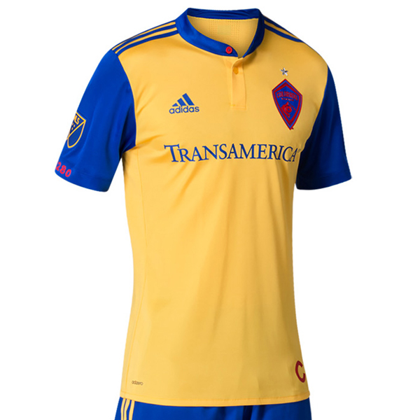
Colorado away
![]()
In a nutshell : As good as the last one and the last one was very good.
The outside back collar has : State flag of Colorado
The jock tag position has : The red “C” from the state flag
The sleeve has : 5280
Compared to previous kit : A little different, just as nice

While I’m sad to be parting with that gorgeous buttery kit from last year, this year is a change, but a lateral move.
I do love me some off colour sleeves, so here we have a yellow kit with blue sleeves, blue cuffs, blue shoulder Adidas striping, blue ringer collar with button up and a red button for no particular reason (which is weirdly refreshing because it usually has some obscure tribute associated to it).
The club refers to it as the “Colorado” kit, and it does a good job of keeping the colour scheme and symbolism without being over the top.
The only strike against this kit is the recolourization of the badge. I understand straying away from their main colours (which need work), but can we work some of the yellow into it? Even if it’s just in the wordmarks within the badge? It looks so dark against a vibrant colour. I’ll take white even.
Get if you : love away kits, wish you were Swedish, need shirts that represent flags in your closet.
Leave a Reply