
Disclaimer : I care and because I want to.
![]()
In a nutshell : OMGWTFLOL.
The inside collar says : a single black star
The outside back collar has : the word mark “Columbus Crew”
The jock tag position has : City of Columbus civic flag
The side Adidas stripes are : red 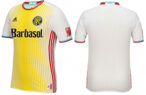
Well Columbus, if there was any question to whether or not you will be the best dressed side in the league, let me assure you that the pressure is off.
As a firm believer that ditching the yellow as the home kit was a giant mistake, it now stands in the shadow of this abomination.
It’s a white shirt, with a yellow bib/horizontal stripes that progressively get thinner as it moves away from the centre. Sky blue and red cuffs on the sleeves and around the shallow V-neck collar. Red stripes down the sides of the shirt. Sponsor and manufacturer in black.
You know what would make this outfit? Sky blue shorts with red stripes and a pair of white socks with sky blue and red tops. And put black Adidas logos on the shins.
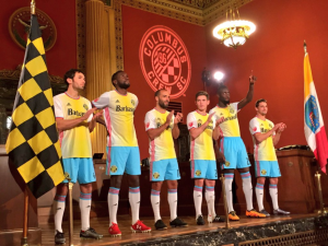
White, yellow, red, black and sky blue. That’s what they worked with. That sounds terrible without seeing a single image.
I cannot imagine how many people approved of this kit. The designers were given a set of instructions/requests from the client. The designers then brainstorm ideas and spitball a bunch of mock-ups. At some point, they offer their best suggestions to their project manager and branding police. Whittle that number down to 3 to 5 options, and then present their findings to MLS and those in marketing and possibly all of the executives at the Columbus Crew. From there THIS was the best one. At least a dozen set of eyes saw this, and somehow none of them bled but not enough of them spoke up. I’ll bet $20 right now that it was designed by committee, and most of that committee have no clue what looks nice.
I’m sure the infographic will go ahead a draw lines to specific parts outlining the ‘meaning’. You can load up all of the justification for your symbolism and decision making, but I assure you : These things do not matter to supporters because they detect it for what it is and that’s bullshit. Supporters want a shroud of pride to wear, and hopefully not be the target of derision because of it. Wanting to wear the shirt because it says “Columbus”, or expecting your customers will buy it because it says “Columbus”, isn’t enough – it should never be enough.
For example I own this Scotland away shirt from 1992/93 and I got it for 3 very important reasons : 1) it was my first Scotland shirt, 2) it was cheap ($20 ish) as it should’ve been and 3) I didn’t know any better because I was 16, and it was one of the first shirts I ever owned. Was I made fun of? Oh yeah, I was. Admitting I still own it should be a reason for further mocking. History looks at that particular shirt and goes “wow, what shite”. This will be the same.
We can guarantee we will see this mess when they’re on the road to DC, Philly, New England and maybe Montreal at the minimum.
Look, if you’re going to go civic, don’t half-ass it. Why not go for a red and yellow kit with a white bib and sky blue sleeves. That would be far more civic than this offering.
This shirt gets a 1 out of 5 because I get where they’re going with it and they had to start somewhere and it was a tough place. They could’ve easily started somewhere BETTER, but why not. If the colours came from some intern’s or owners wife’s imagination, then it would be a zero.
Also, for future reference : flags with seals do not make good iconography. For example, Chicago, DC and Toronto’s flags look good. New York and Columbus’ do not. Apparently someone at a TED Talk agrees.
Get if you : hate the person you’re gifting it to – knowing you never paid full price for it, always wanted to be a “soccer player clown” for Halloween but wasn’t quite sure how to make the outfit work
Leave a Reply