This could be considered shameless clickbait, but that’s because the seven of you who read this are WEAK (just like me)! If you agree or disagree, please leave a comment down below or bug me on Twitter. Remember though : I probably hate your club.
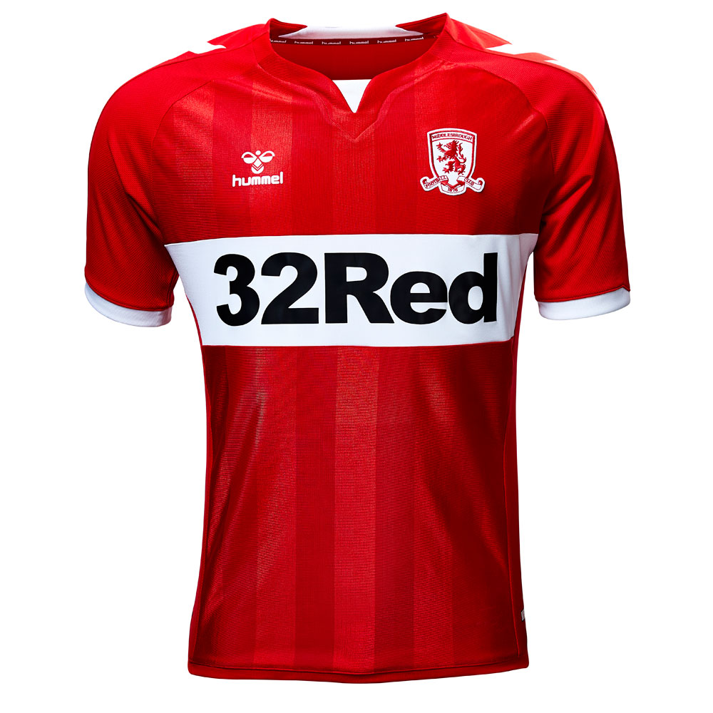
Middlesbrough Home
![]()
Manufacturer: Hummel
In a Nutshell: Classic Boro look with chevrons.
Club shop link to save you the trouble

I have a long-running love of Hummel kits. Don’t get me wrong, Macron is the current hotness by a large margin, but Hummel and I have history. As they have history with so many other clubs. There’s something about the chevrons that Hummel uses that makes so many of their kids simple and iconic. Take the current offering of Middlesbrough FC.
Here we have Boro’s classic look – red shirt with white band across the chest. The kit has red sleeves white cuffs, white chevrons going from the top of the shoulder down the sides, and within the chest are stripes that are sublimated.
This shirt looks so good I’m not even vaguely angry at the seemingly large Sponsor in the middle of the white horizontal band. It actually kind of looks like it belongs there. While I’m not too crazy about the collar, I do have a lot of forgiveness because it is Hummel and they do great work (even if they’ve been having a lot of problems with delivering their shirts on time this season #supplyChain).
I desperately want this. It’s beautiful
Get if : you have exquisite taste, and everybody you know whoever doubts that you have exquisite taste will be reminded that you do, in fact, have such exquisite taste simply by wearing it.
Newcastle United Away
![]()
Manufacturer: Puma
In a Nutshell: An attempt at reliving the past.
Club shop link to save you the trouble
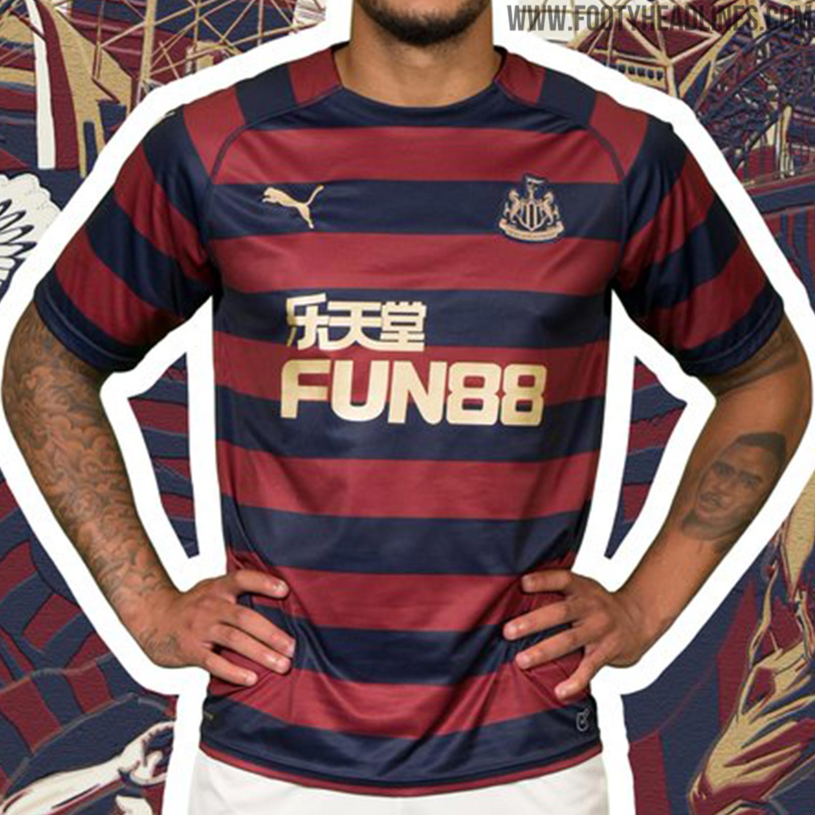
So, this is an homage to a classic Adidas kit from 1995, and Puma is the company that is attempting to execute such a tribute.
Full disclosure, that original Adidas kit is about as perfect as it Jersey you will ever find. It’s perfect because it screams Newcastle, it’s only in a way shirt and it just reeks of class.
Puma stuck to the colors and the hoops, cherry red and navy, and it basically runs throughout the entire shirt. The sponsors are in gold, for some strange reason, and the color has nothing to it. In fact the more you stare at it, the more you wonder if there actually is a proper collar. And also, the more I stare at it the less impressed I become.
In my mind, this shirt was a Solid 4 out of 5, but I’ve decided to take it down a further point. It tried to be a classic, it tried to be a tribute, but the key elements that made that shirt perfect were not copied over. Granted I’m sure this bedinghaus sponsor wouldn’t want to move over for a local beer company, but the lack of an attempt at a real collar diminishes the entire shirt.
That being said, if you are a Newcastle supporter, this is one hell of a shirt. And if you do love this team, you should own it.
Get if : you are a dyed-in-the-wool Geordie, you weren’t around to appreciate the old kid but admired it, just like hoops.
Espanyol Home
![]()
Manufacturer: Kelme
In a Nutshell: Clean, strong, smiple.
Club shop link to save you the trouble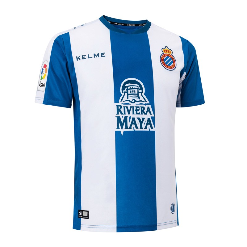
Full disclosure, I have a slight bias towards this club. And part of the reason why this shirt makes the list, is that they’ve had some disgraces of a kid over the last couple of seasons. However comma after ditching Joma and going with Kelme, which I’m surprised they’re even in the game still, this is a really simple, gorgeous shirt.
The shirt has very wide blue and white stripes, the sleeves also have the blue and white stripes, and features a blue ringer collar. Part of what draws me to this shirt is the subtleties. First off the sponsor’s color scheme, be it deliberate or accidental, doesn’t ruin the aesthetic. Secondly, the badge sits on the white stripe but has a blue outline stroke of it, which really drawers importance to what the badge means. Lastly, tell me leaves there paw print logo off of the front of the shirt. It appears on the top of the shoulder, which is a perfectly fine place to put it, however it doesn’t add to, and otherwise, clean look. Its absence makes it less busy.
Get if : you’ve been waiting for a nicer shirt then anything Joma offers over the last couple of seasons, you like a simple but attractive soccer jersey, you just like Barcelona and Real Madrid.
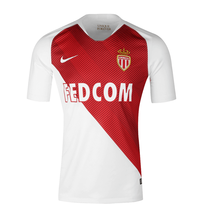
AS Monaco Home
![]()
Manufacturer: Nike
In a Nutshell: Modern take on a classic look.
Club shop link to save you the trouble
If you are like me, you haven’t exactly been impressed with Nikes offerings over the last couple of years in general. They all seem to be following an elaborate template Style, where though they are unique to each club, they’re still very similar. For example, they’ve been using a lot of topographical maps of the Cities which they sponsor, and that is interesting, but it’s also not when six other teams have it, and the profile and money that’s being thrown around no longer is unique. I realize I may be splitting hairs, but so be it.
However, this showed up.
Monaco’s new home kit is absolutely gorgeous. It has the Hallmark red and white diagonal half shirt, white sleeves, and a very odd White Collar, if you can kind of call that a caller. What really sets this design apart, is the diagonal striping that happens within the red section of the shirt. There’s a gradient of various line thicknesses within each stripe that is striking, original, stylish, progressive, all things that Nike haven’t been in a while.
And I kind of feel disappointed for many of the other clubs that Nike sponsors that do not have as nice of a home shirt as Monaco does. When I first saw this shirt it had no sponsor, which made it the best shirt of the year, however it has a sponsor, and thankfully they are playing along by sticking with the colors of the club.
Get if : you are one of those weird people that loves Monaco and have been looking for the right shirt to get, well this is the one.
Crvena Zvezda Away
![]()
Manufacturer: Macron
In a Nutshell: Denim-ish in a not-terrible way.
Club shop link to save you the trouble
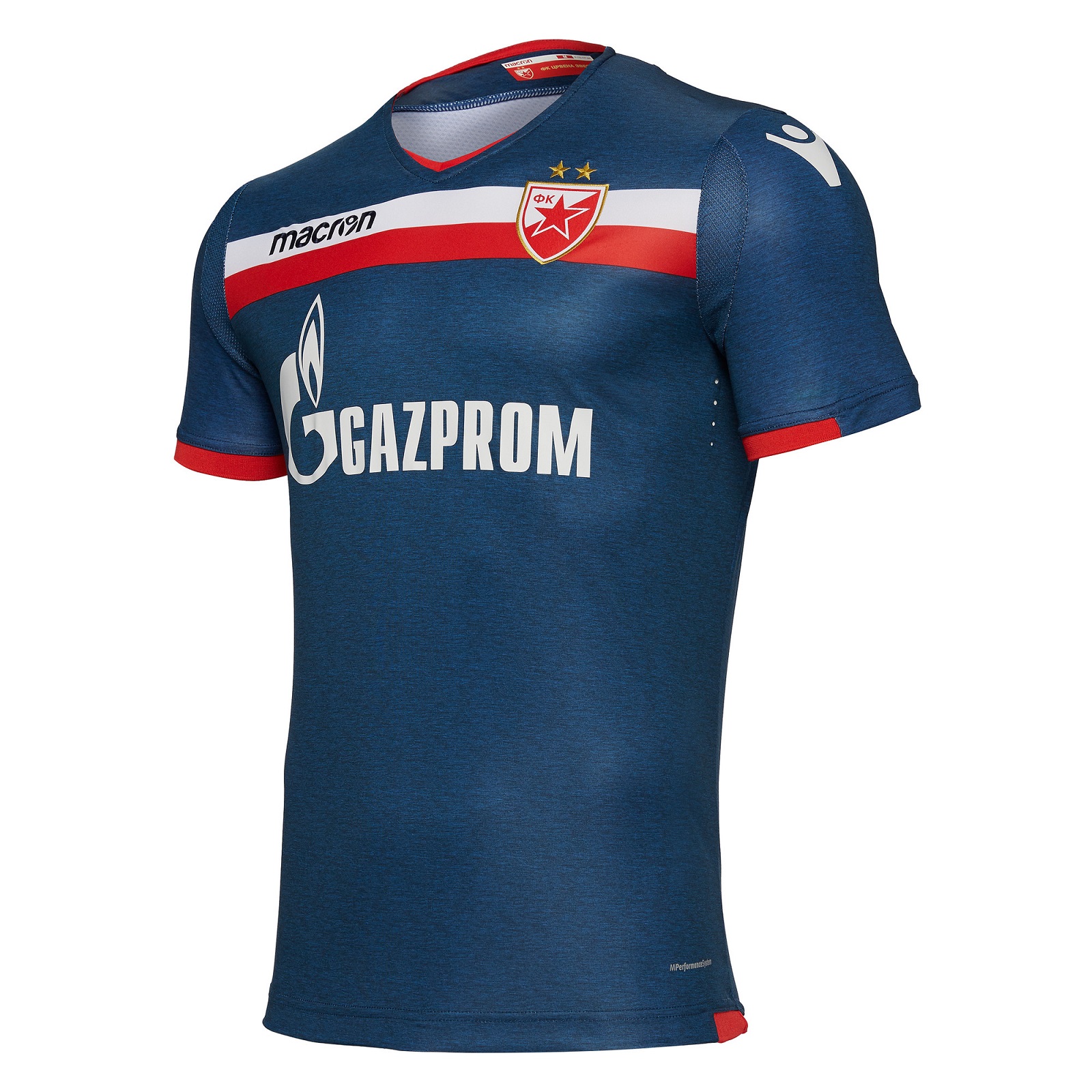
The club you formally knew as Red Star Belgrade have had some really nice shirts both home and away over the last couple of seasons, and that’s all due to the fact that they are made by Macron. And while I did not deliberately overlooking past offerings, this away shirt really caught my attention.
The shirt is predominantly navy blue, almost a dark denim jean look, doing part to the fact that it looks kind of heathered, which is a weird weakness of mine. There is a white and red band that goes from shoulder to shoulder just beneath the throat of the collar, the cuffs are half not, half red, there’s red trim along the bottom of the shirt that extends around the back from hip to hip, and the macron icon sits atop the shoulders at each arm of the sleeve. The name of the club appears at the back of the neck in white Cyrillic text.
Get if : you want one of the nicest shirts in the Serbian League, you like it when your top matches your pants, you are a giant Macron fanboy like the person who wrote this.
Leave a Reply