Disclaimer : I care and because I want to.
![]()
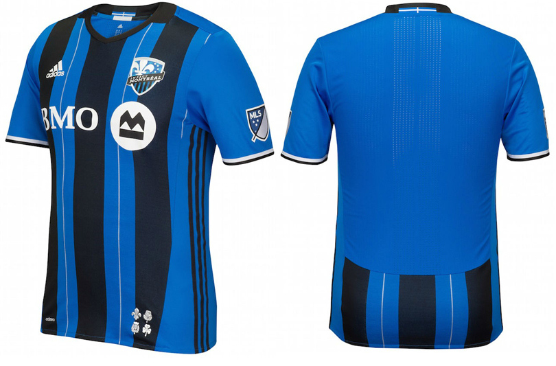
In a nutshell : Blue and black stripes with additional stripes at no extra charge
The inside collar says : White St. George’s cross on blue (the cross on the civic flag of Montreal)
The outside back collar has : White St. George’s cross on blue (the cross on the civic flag of Montreal)
The jock tag position has : a thistle, shamrock, rose and fleur-de-lis (the four flowers on the civic flag of Montreal)
The side Adidas stripes are : black 
When Montreal released that “third” kit where they looked like Inter Milan, I was mad, because they finally had a look with some character. It looked great. I even went as far as keeping an eye out for sales. You know. Just in case.
Hedging my bets that it would be made the official home kit and finally paying off my debts to that Taiwanese kit gambling cartel (do YOU have $50 in your pocket? No? Didn’t think so…), I was disappointed to hear that they were going to be “the blue team” for ever more.
Bam, then this happened.
Blue and black striped shirt, blue sleeves with black and white trim, the black is-it-a-collar-or-is-it-part-of-a-shirt collar with shallow V-neck and black side striping. It’s really nice. And even though I find the jock tag thing patronising at a level beyond when teams to the camouflage thingie “for the armed forced”, this is actually kinda classy. The inside of the neck has the “Tous Pour Gagne” club motto. Not that it matters since I rarely look at the inside neck of a shirt, but sure. No harm there.
But, that pinstripe. In the middle of each of the blue stripes is a white pinstripe. It bothers me. AC Milan did this for the 13/14 season ago and in both cases, it doesn’t enhance the shirt. It makes it unnecessarily busier than it should be. If the pinstripe was black, or a darker blue, or an embossed stripe, everything would be fine and this would be a classic. This is the only thing I can say negatively about the shirt, and for most fans and customers, I could see it not being a big deal. Some, this would be a plus.
Get if you : dig the Inter Milan look of Montreal, want something nicer than last year’s offering
Leave a Reply