Disclaimer : I care and because I want to.
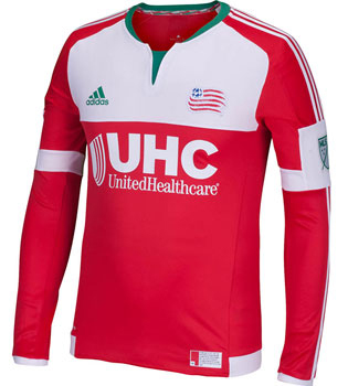
New England Revolution away
![]()
In a nutshell : Christmas has come really early
 It’s bland. Very very bland and ordinary. If you have ever been a kit nerd like myself, you’d expect to see a similar shirt style in non-league England or the Bulgarian league, but it isn’t. It’s in Major League soccer. They’re using one of the mandatory current Adidas templates for the cuts, red shirt with white trim.
However.
The thing that sets this apart is the trace amounts of green that appear on this kit. And that makes it unique. As previously noted, MLS has a thing for shirts not to stray from the club’s pallet. Typically New England have had a navy home/white away but this time, it’s a red with green trim, which is referenced on the jock tag that has the flag of New England and an explanation of the flag. The flag is red with a white ensign and a tree inside the white ensign.
It’s a 2 out of 5 kit with a bonus point for principle. Way to be brave designers and marketing deparment.
Get if : you just want to see something different if only once, feel your jersey collection lacks tree representation
Leave a Reply