Disclaimer : I care and because I want to.
New York Red Bulls home
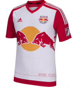
In a nutshell : Reverse Arsenal with animals.
 This is the most contrasting kit of the bunch. On the one hand, I’m kind of upset how Red Bull circumvent the advertising rules by owning the team. On the other hand, it is a marketing masterstroke. Use corporate symbolism as the badge, use badge elements EVERYWHERE. It’s a vicious cycle.
All of the usual elements that annoy you about Red Bull is still in play, two charging bulls in front of a sun (I assume it’s a sun) dead centre and massive on the front, oversized name of club on the lower back. If you were cool with the overuse of Red Bull, this kit is really nice. And if you’re not, it’s not as terrible as it could be.
Instead of the mandatory jock tag, the designers with with the “skyline” effect (their words, not mine) of New York on the bottom, which, for a thin stroke, is simple enough without drawing the eye to it.
I do like the red sleeves and white chest. Always a fan of dissimilar elements of the shirt. Red cuff along the bottom of the shirt makes this a nice piece.
Get if : you like an improvement, you’ve waited for the best looking NYRB home kit ever (and it very well may be).

Leave a Reply