Disclaimer : I care and because I want to.
![]()
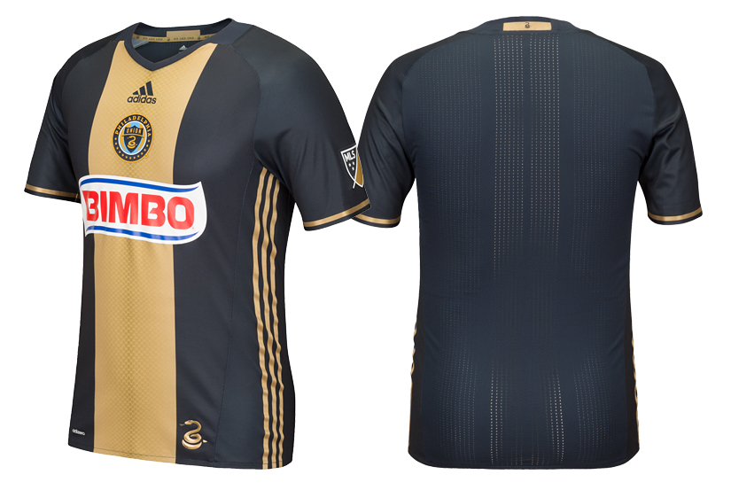
In a nutshell : it’s got snake scales down the front
The inside collar says : “We Are One”
The outside back collar has : the coiled snake
The jock tag position has : the coiled snake again
The side Adidas stripes are : gold
Some of the teams in this league have a colour problem. When the meetings with creative came about, they had thought of everything except how this would work in practice.
Exhibit A : The Philadelphia Union home kit. I have nothing against navy or the teams that use navy or aquatic military personnel for that matter. It’s that it’s dark. Like, SUPER dark. It looks like charcoal. Or black. Now I know that they use navy, because I’ve seen the logo, I’ve been to the website, I’ve even visited their beautiful stadium. But does it need to be so dark? (Answer : No.)
That being said, this kit may be as good as it ever gets with the colours at play. The golden bib/Ajax stripe is very striking this year. It looks sharp, flattering and plays into the snake icon of their badge. The reptile skin pattern looks like it’s shimmering and it’s subtle enough to not get annoying. Adidas’ move of the three stripes from the tops of the shoulders to the sides give them a fresh approach at designs, and the gold subtleties are very complimentary.
Also, You gotta do something about that red, white and blue Bimbo advertisement. Monocolour it? Something less distracting.
Get if you : have the same opinion about too dark colours, but are conflicted with it being your team and you finally want to get a home kit
Leave a Reply