Disclaimer : I care and because I want to.
Portland Timbers home
![]()
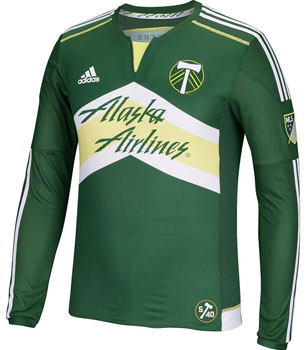
In a nutshell : big chevron, big advertisement, big eyesore
 I get it, you have the chevrons in your badge. And it points up. So why in the bluest (or greenest) of hells would that be necessary to make it a blatant design feature? You have a predominant forest green kit with this big white & lemon space so let’s fill it with a sponsor. I’ve looked at kit guidelines for the English FA, and while I do not have a copy of this kit infront of me to measure, that sponsor looks absolutely MASSIVE. That is huge.
I’ve never been a fan of whispy colours (read : anything that you’d describe as “light _____”) but this almost looks like a factory mistake it’s so light.
The collar has some getting used to with the cut at the neck revealing more lemon yellow, but it’s just awkward. Also, this kit loses points for using a stripped down version of the badge without words and the west coast revisionist history that is “5/40” jock tag that is supposed to represent 5 years in MLS and the 40th anniversary of the first Timbers (I didn’t think you could celebrate an anniversary of something that disappeared for 3 years in the 80s and a decade in the 90s).
I’m OK with the chevron itself, but I’d shrink the advertising and remove the yellow-stain inner chevron and start from there.
Get if : You like wearing things that point upward.
Leave a Reply