Disclaimer : I care and because I want to.
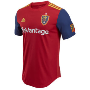
Real Salt Lake Home
![]()
In a nutshell : Red with navy sleeves
The inside collar says : nothing.
The outside back collar has : nothing?
The jock tag position has : seriously nothing?
Compared to previous kit : Nice improvement
RSL has something that many of the clubs in the league wish they had, and that’s a strong colour palette to work with. The navy, red and yellow combination has so many potential combinations that short of being lame, it’s hard to screw up.
This isn’t lame. Not by a long shot.
Red chest with yellow Adidas shoulder striping, red ringer collar, navy sleeves. I’m optimistic that based on the images I’ve seen, there’s an absence of the usual MLS kit malarkey : slogans on the inside collar, phrases on the back of the neck, symbols at the bottom left of the kit. Also, I cannot find any patterns, good or strange, within the fabric of the chest. It’s a classic classy kit.
My only strikes against it, and they are a bit petty, are the sponsor sits in white, which could’ve easily been yellow and would’ve looked amazing, and that they could’ve had some kind of pattern in the chest; diagonal pinstripes, checkers, lion’s head wallpaper effect. Like I said, petty. It’s really a 3.5 out of 5, but I’m not doing halves AND I feel that they are on the way of having some of the best looking kits for years to come.
That being said, it’s one of the best RSL home kits to date. Well done.
Get if you : have been patient for something that isn’t weak, like different coloured sleeves
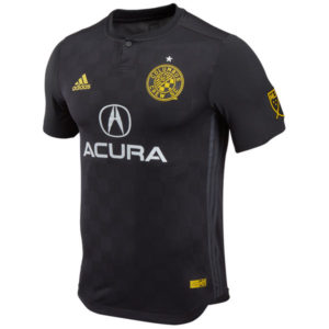
Columbus Away
![]()
In a nutshell : Precourt sucks and this is super black
The outside back collar has : a yellow shield with 96 inside it
The jock tag position has : Charter Member #01
Compared to previous kit : a bit of a step back
It’s like Precourt is deliberately trolling his team’s fan base.
“Charter Member #01” and “96”, the debut season, is like a slap in the face given his unapologetic attempts to leave the city after failing to hold the team ransom for a new ground failed. Yes, let’s lean on history for symbolism. I supposed the symbolism of the badge lit on fire would’ve been too on the nose.
Politics and shitty shady business aside, it’s a solid kit.
Black kit with black ringer button top collar, black Adidas striping from armpit to hip, with more black and even more black. The gold really pops off this kit, and the sponsor, though doesn’t play along, somehow works off of the silver star over the badge.
I have functional issues with black kits, especially in a summer league where so many teams play in the south, not like it’s mild in the north in July. Players will bake in this. And the symbols chosen against the backdrop feel like it’s a cruel joke against the supporters.
Get if you : you’re Adrian Precourt, you love the Crew but really hate the city of Columbus, can follow this league without its backroom farces.
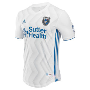
San Jose Away
![]()
In a nutshell : white with zigs and zags
The outside back collar has : badge of a Navy Seal Foundation
The jock tag position has : SJ74
Compared to previous kit : better
I’ve probably mentioned this before, but the funny thing about club nicknames that sound neat but can’t draw is that attempts to actually visualize it can be silly or be nice. The old Quakes badges are, in a word or two, fucking terrible. This one is nice. I very much dig it.
Now that we’ve established a visual pattern to represent an earthquake via fault lines, now lets expand upon this.
And that’s how the zig zags were born.
You have a white kit, white v-neck collar, thin blue trim on the sleeve cuffs, blue Adidas stripes from armpit to hip. The sponsor plays along in the blue of the badge/trim. It’s nice, without being boring. I will miss the absence of red, a deliberate nod to the original Quakes of 1974 (who still have no relation to the current one except by name alone), but they can always go back.
Get if you : like patterned white kits, like a shirt that when lying flat on the floor looks like it was run over by a car


