Disclaimer : I care and because I want to.
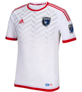
San Jose Earthquakes away
In a nutshell : OK no.
 Here’s what is good about this kit : the embossed pattern found in the club badge that’s supposed to represent fault lines.
Now that that is out of the way, let the white kit garbage go. Are Adidas’ profits slipping? Did dye become super expensive? What the hell. This may be the whitest of the white kits, which makes me fairly angry.
In the MLS press release, the word “retro” gets tossed around, as an homage to the clubs of yesteryear. Well why half-ass it? Go full retro, put black trim and the old-style Quakes wording across the chest. Adidas made most of their old kits anyways, why not. Not like there’s a legal issue? That would’ve been a CLASSIC given that there’s no sponsor anyways. And I know this is their away kit, but if you’re going to reminisce, why reminisce over the away kit when the home kit was red!?!
Then there’s the revisionism. Of all the pacific clubs that engage in this practice. There was a distinctive 8 year gap where San Jose was not at all a hotbed of prideful footballing support. San Jose 1974 on the jock-tag (well it says SJ74 but what else could it mean) is definitively meaningless. It’s acknowledges the past, while forgetting all the crap that follows it. Don’t get me wrong, I love the name and I believe the renaming or naming of current clubs with the NASL names was a very good move, but co-opting this fantasy of history and using that to sell a phoned-in shirt is insulting and disingenuous. This is not ever going to be worth $80-100.
Get if : you like reminiscing about the away kit of a club you were likely never alive to see, like nice patterns in shirts.

Leave a Reply