Disclaimer : I care and because I want to.
![]()
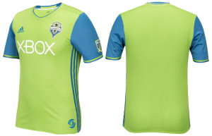
In a nutshell : Green shirt, blue sleeves
The inside collar says : “Sea of Green. Sky of Blue”
The outside back collar has : Sounders FC
The jock tag position has : seal of Seattle
The side Adidas stripes are : blue 
If different coloured sleeves and shirts are what is in fashion this season, I’ll take it. It takes bad colours for it to not work, and most MLS teams have good colours to work with (not you Houston). I’ve been a fan of Seattle’s colour scheme from day one as it is unique to football, and it still keeps with what most sporting fans consider the colours of the city, unlike some who went with red when everything else is blue (talkin’ bout you Toronto).
The Seattle shirt is a fairly straightforward affair. Blue sleeves, green chest with obligatory shallow V-neck. White sponsor washes out a bit, and doesn’t look out of place. The green fabric of the shirt has a rather small “SS” that kinda looks like wheat stalks.
When it’s simple and subtle, it’s hard to argue it. I’m struggling to find fault with this. It really feels like a 4 out of 5 on one hand, but on the other, I don’t know if I could be happier if I were a Sounders supporter or a kit nerd.
Get if you : like nice things, want what could be the classiest shirt Seattle will have for a while, like tiny S’s all over the place

Leave a Reply