Disclaimer : I care and because I want to.
Vancouver home
![]()
In a nutshell : triangles EVERYWHERE!!!!
The inside collar says : Our All. Our Honour.
The outside back collar has : Flag of Canada
The jock tag position has : since 1974
Compared to previous kit : A step backwards
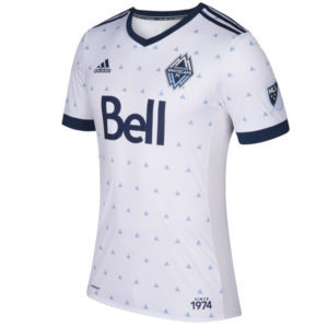
Rain.
Not mountains, why would it be mountains? Mountains are in the badge. It’s supposed to represent rain.
I first thought of a dress shirt from the 60s that my family doctor wore up until his retirement, which was acceptable because that was the style at the time and he wasn’t a footballer.
Navy v-neck collar, navy cuffs and navy Adidas top of the shoulder striping. And then we triangle all over this mutha. It’s on the sleeves and the chest, and not the back. Fun fact : one major difference between authentic and replica kits is that the triangle motif does not appear on sleeves on the replicas. The replicas look nicer than the authentics.
I realize they wanted something different, and this is certainly different but… no. Looks too old man for me.
Get if you : love, like really love, things with triangles on it, want a kit that screams faux-vintage in all the wrong ways.
Los Angeles away
![]()
In a nutshell : Another dark blue kit, and it’s still nice.
The outside back collar has : LA Galaxy wordmark
The jock tag position has : This is LA
The sleeve has : A single four-pointed star from badge
Compared to previous kit : Not as nice as the last one

Do you like dark blue? Do you like dark blue with dark blue trim? Then Adidas is about to deliver in spades. Dark blue spades.
Here you have the away kit of the Los Angeles Galaxy and it’s dark… and blue. It’s a dark blue shirt with the lighter dark blue (look at it! Tell me I’m lying by that description!) Adidas striping at the top of the shoulder, on the cuffs and around the ringer collar. The gold elements really pop off the kit, but so does the advertiser, which I’m sure makes them very happy. The front of the kit has the similar pattern that appears in the Chicago away kit, but because the colour is dark to begin with, it kinda works much better.
Get if you : like the colour, like your advertising to appear like it’s illuminated.
DC away
![]()
In a nutshell : I’ve been told those are feathers you’re laughing at
The outside back collar has : District of Columbia
The jock tag position has : DC license plate “DC UNTD”
The sleeve has : DC United
Compared to previous kit : It’s close to call.
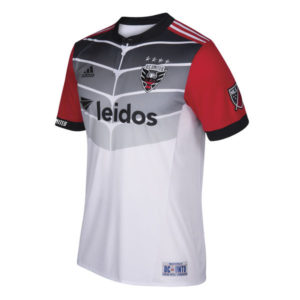
Oh Adidas. You got half-way brilliantly and then it all fell apart.
Here’s what they did right. Red sleeves with black cuffs, white stripes on red shoulders, black ringer button collar. It looks amazing. This would be top shelf if they just had a plain white chest. They put the DC license plate as the jock tag which is so cute (yeah, I said it). Weirdly, seeing “District of Columbia” spelled out in full on the back looks strong and serious.
*sigh* then there’s the chest. My first reaction was “uniform of a C-level super hero group that didn’t make it to issue #5 in the early 90s”. Second reaction was “someone with that physique needs to see a medical professional”. Then I realized it was the feathers in the badge. It’s another case of a great idea on paper that didn’t execute on the shirt.
Get if you : re a sleeve person when selecting your kits, wish you were in a C-level super hero group.
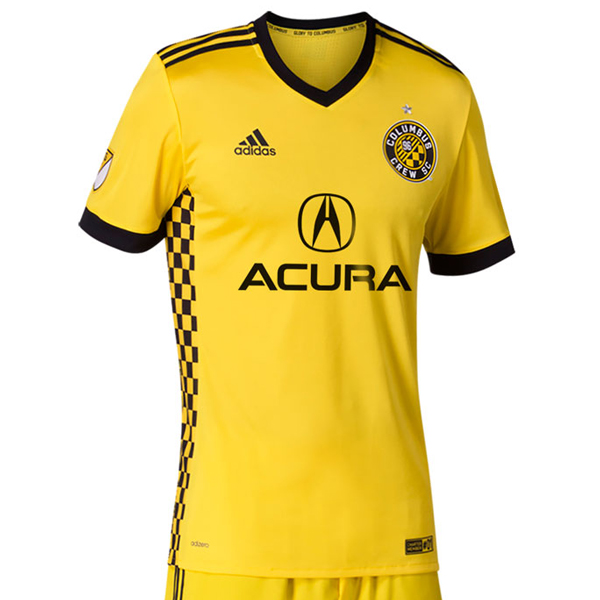
Columbus home
![]()
In a nutshell : Feels like home.
The inside collar says : Glory to Columbus
The outside back collar has : Monochrome flag of Ohio
The jock tag position has : Charter Member #1
Compared to previous kit : Mistakes of the past have been corrected
Member Columbus Crew’s ugly away kit? I member. #southPark
Well, here’s how this goes. After supporter backlash (and a pinch of embarrassment), the black kit is back to being the away kit and the home kit gets replaced with this sucker.
And they fix it with this beauty. Primarily yellow kit with black cuffs, black v-neck collar, black Adidas stripes on the shoulders. The side panels have a yellow and black checker pattern from the badge and it’s what sets this apart from being a template kit.
I will miss the old sponsor, because it was fun to say “you have shaving cream on your shirt”. But now it’s Acura, so that makes it difficult to mock. We’ll always have bread and multi-level marketing schemes to poke fun of.
Get if you : love checkers (and I do), like a classic kit, want to forget last season.
Leave a Reply