Disclaimer : I care and because I want to.
Colorado Home
![]()
In a nutshell : no white sleeves make it better
The inside collar says : Colorado For Life
The jock tag position has : state flag of Colorado
Compared to previous kit : drastic improvement
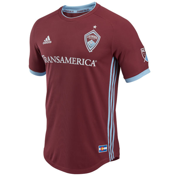
The new Colorado home kit is clean and finally has taken advantage of their colour scheme. Why they went with claret and white for so long when the light blue was right there.
Granted the jersey itself doesn’t have much of the sky blue, but it’s used in all the right way. Sky blue Adidas stripes down the sides of the shirt, a sponsor that plays along and isn’t garish *cough*Bimbo bakeries*cough*, ringer neck with slight sky blue trim, sky blue cuffs.
This is the best home kit they have ever had, but it’s been a low bar. But what makes this the best kit…
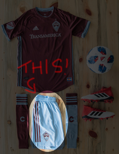
The shorts. They compliment. This is a uniform you can be proud of. I mean no one wants to be the full kit wanker, but… It goes so well… I’d forgive it.
Get if you : finally want a sweet home kit to go with your sweet away kit, like claret tops (and who doesn’t), like nice things, like to go outside in full kit.
Dallas Home
![]()
In a nutshell : nicer, cleaner but looks like a training top
The outside back collar has : Pride of Texas
The sleeve has : A star with the initials LH inside it
Compared to previous kit : slight step forward
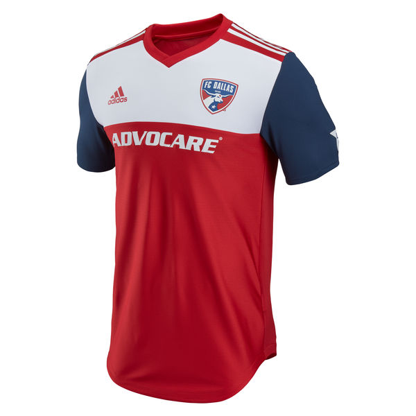
So I reviewed their last home kit as a 3 out of 5. And looking back at it, that’s generous.
For all intents and purposes, this is a much nicer kit. Dark blue sleeves with no cuff trim (which doesn’t happen often in this batch), red v-neck collar, red Adidas shoulder stripes on the white upper quarter with a red front. I do like the ongoing tribute to Lamar Hunt with the initials on the sleeve inside the star.
The hoops are gone. Congratulations, you’re boring now.
Here’s the thing. This looks like a training top. That white upper part and the cut with a slight arch screams warm up from a few years ago. I can’t not unsee it either.
Yep, this is tribute to Texas as Dallas is the only city and team in the state. Yeah, sorry Houston, you’re not Texas enough. Deal with it. Cry in your sleep. How about a shirt that tributes Dallas? Or even the TV show?
Get if you : never cared how horizontal stripes looked on you, like dark sleeves, OMG LOVE THE TEXAS!
DC United Home
![]()
In a nutshell : less white, more silver, all black
The outside back collar has : coordinates
The jock tag position has : Jurisdiction of the United States / 1792
Compared to previous kit : lateral move
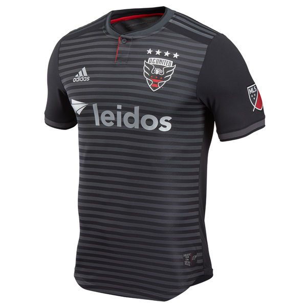
Hat tip to the guys at the Filibuster Podcast, there was an interview that they conducted with the DCU director of marketing regarding the development of the kit. It’s very interesting and worth a listen (starts at 44:00 mark).
The kit is black and silver. Dark grey Adidas stripes on the shoulder, silver sponsor, silver numbers. The chest has thinner horizontal stripes as last year’s offering. Dark ringer button collar with red trim underneath.
I miss the red. The socks have the flag of DC on the shins, which is nice, but it can still have more red and be ‘very little red’. Red button within the collar, perhaps? OK, that might be all the wiggle room based on the design. I see what they were trying to accomplish, and though I’m not crazy about it, it’s good. It’s a solid bit of kit.
Get if you : thought the old one was too bright, want to be a ninja that wears a soccer kit, really like to be shiny, never cared for red.
Leave a Reply