
Disclaimer : I care and because I want to.
![]()
In a nutshell : Simple and classic
The inside collar says : Taxation without Representation
The outside back collar has : black outlines of DC landmarks
The jock tag position has : The geographical shape of DC with the flag inset
The side Adidas stripes are : 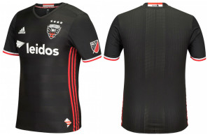
So they’ve got a new badge, which some people dislike, but I feel is an upgrade. And with a new badge comes a new kit.
It’s predominantly black with minimal trim. Red and white cuffs but black shallow V-neck collar.
The shirt itself has embossed hoops. Red Adidas stripes down the side.
White sponsor and Adidas logo.
It feels like this description is simple, but what’s wrong with that? Nothing. These kits look absolutely smashing and they are simple. Adidas has been phoning in many kits globally in the past few seasons (Bayer Leverkusen and Anderlecht, both Champions League teams with pallet swaps of one another), allowing many of their contemporaries, big and small, to catch up and surpass them in the kit design business. After so many years of MLS teams getting low-level template kits, they’ve been on the receiving end of the experimental stuff. Some of it bad, some of it really bad, and some of it excellent, but more importantly, not seen in a pallet swap elsewhere. If this is the future of Adidas design, their clubs should be better looking for it… but so far, with this batch been released at this point, it’s exclusive to MLS.
Get if you : collect top-shelf DC United kits, like nice things.
Leave a Reply