Tag: 2015 jersey weak
-
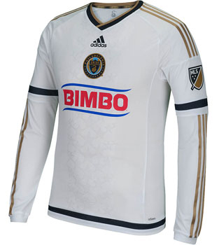
Kit Nerd Corner : Philadelphia Union away
Disclaimer : I care and because I want to. Philadelphia Union away In a nutshell : Why bother trying. Philadelphia have been on a slippery slope downward. Their first away kit was a decent reverse of the home kit. Their next kit was their home kit under brighter lights. Then this happened. It’s so ordinarily…
-

Kit Nerd Corner : New York Red Bulls home
Disclaimer : I care and because I want to. New York Red Bulls home In a nutshell : Reverse Arsenal with animals. This is the most contrasting kit of the bunch. On the one hand, I’m kind of upset how Red Bull circumvent the advertising rules by owning the team. On the other hand, it…
-
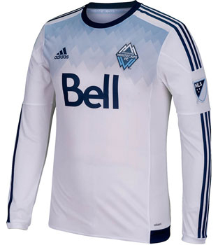
Kit Nerd Corner : Vancouver Whitecaps home
Disclaimer : I care and because I want to. Vancouver Whitecaps home In a nutshell : simple, modern without being garish If Vancouver is fighting to not have boring template kits from Adidas, then they are making the battle count. Starting with the obvious pattern, definitely a fan of the gradient ‘mountains’ that start from…
-
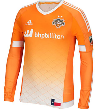
Kit Nerd Corner : Houston Dynamo home
Disclaimer : I care and because I want to. Houston Dynamo home In a nutshell : Finally, a Houston kit with some real character Really digging the gradient of orange down to the white at the bottom and the diamond/fence pattern pinstripe print of the shirt. Very happy to see them drop the awkward…
-

Kit Nerd Corner : DC United away
Disclaimer : I care and because I want to. DC United away In a nutshell : new Adidas template that throws subtlety out the window Over the years, DC United has been bland with their away kit : just the inverse of the black kit. A few years back, they blew minds by offering…
-

Kit Nerd Corner : Chicago Fire away
Disclaimer : I care and because I want to. Chicago Fire away In a nutshell : Inoffensive to the eyes, isn’t strict in sticking to the official colours Not everything needs to be a dramatic departure. Not everything needs to be zany or bright or grabbing attention or annoying or crowdsourced. It can be simple…
-

Kit Nerd Corner : LA Galaxy Away
Disclaimer : I care and because I want to. Los Angeles Galaxy away In a nutshell : It’s a stunner. Simple, subtle and a little different. As much I quietly miss the gold/teal Galaxy look from years gone by (but not the badge), the white/navy combo has been a step up in class. They have…