Disclaimer : I care and because I want to.
Houston Dynamo home
![]()
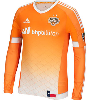
In a nutshell : Finally, a Houston kit with some real character
 Really digging the gradient of orange down to the white at the bottom and the diamond/fence pattern pinstripe print of the shirt. Very happy to see them drop the awkward “Space City Blue” that they use in their badge. It’s terrible.
Here’s a team that could do a better job of using the Raven Black (or a better shade of it) as their trim, just to break it up. Collar and cuffs, especially. Maybe throw some of it into the V-neck collar as it is an ordinary white.
I’m not against state pride, but I don’t feel the state flag was necessary as a jock tag at the bottom right of the shirt. Could’ve been a neat opportunity to “Houston” up the state flag and use the clubs colours (then sell that flag at games). It draws the eye away from the shirt as a whole, and I can’t imagine “Texas” being more important than “Houston”, since there is another side from the state in the league.
Get if : you’ve been waiting for something interesting you would be proud to wear on non-game days
Leave a Reply