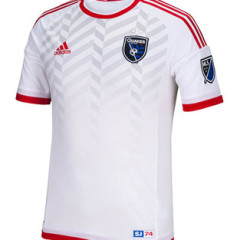
Kit Nerd Corner : San Jose Earthquakes away
Disclaimer : I care and because I want to. San Jose Earthquakes away In a nutshell : OK no. Here’s what is good about this kit : the embossed pattern found in the club badge that’s supposed to represent fault lines. Now that that is out of the way, let the white kit garbage go. Are Adidas’ profits slipping? Did dye become super expensive? What the hell. This may be the whitest of the white kits, which makes me fairly angry. In the...
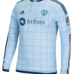
Kit Nerd Corner : Sporting Kansas City home
Disclaimer : I care and because I want to. Sporting Kansas City home In a nutshell : it’s close, but in the end it lacks subtlety When I first laid eyes on this kit in an earlier leaked image, I really began to hate Sporting KC for more than just football. First they get that hooped beauty away kit and now they get this graph patterned home kit. Teams you hate shouldn’t look good, it just makes it worse. But upon further review and...
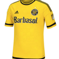
Kit Nerd Corner : Columbus Crew home and away
Disclaimer : I care and because I want to. Columbus Crew home and away Columbus could have had it so much easier than this. As a bias towards football’s black and yellow, I’ve oft been disappointed with the offerings the pseudo-rivals have offered. There was that ‘stripey sports bra’ look, which was approved by many people without tastes in suits no doubt, which went from boring to terrible, a first from the club. But then...
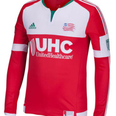
Kit Nerd Corner : New England Revolution away
Disclaimer : I care and because I want to. New England Revolution away In a nutshell : Christmas has come really early It’s bland. Very very bland and ordinary. If you have ever been a kit nerd like myself, you’d expect to see a similar shirt style in non-league England or the Bulgarian league, but it isn’t. It’s in Major League soccer. They’re using one of the mandatory current Adidas templates for the cuts, red shirt with white...
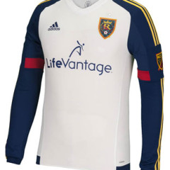
Kit Nerd Corner : Real Salt Lake away
Disclaimer : I care and because I want to. Real Salt Lake away In a nutshell : fits the colour scheme, nothing remarkable This has to be a marketing manouvre as it seems like over half the league has a white kit, with eight of them (new ones anyways) being away kits. Throw another one to the pile. The new RSL away kit is fairly ordinary, however credit needs to be given for the navy sleeves with the red swatches and the gold...

