Disclaimer : I care and because I want to.
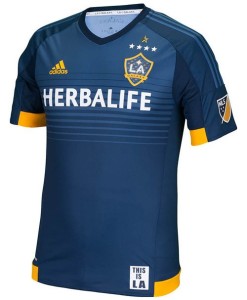
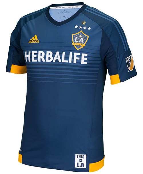
Los Angeles Galaxy away
In a nutshell : It’s a stunner. Simple, subtle and a little different.
 As much I quietly miss the gold/teal Galaxy look from years gone by (but not the badge), the white/navy combo has been a step up in class. They have dressed like a the most dominant club in the league, even when they haven’t been.
Previous away form has been consistent with the dark greyish-blue as a base with a WTF 3rd kit, but this is in line with Adidas’ templates without being too cookie-cutter. The gold trim at the bottom at the waist that wraps around the back, the kit manufacturer logo and the inside of the sleeves accent this shirt nicely. The use of the lighter shade of the dark greyish-blue in the horizontal gradient bar and the three stripes down the arm is a bit of a departure from the league-wide mandate of “use only your approved official pallet”. The stripes accent rather than blatantly remind you that this is an Adidas product. Whether it is intentional or not, the sponsor in white feels equal to the amount of gold on the kit so one doesn’t overpower the other as a secondary colour.
I would like to take a point away for the oft-prevalent ‘jock tag’ informing you that “This is LA” and the stars seem to be a little on the large side, but I can’t do it. This is a quality looking kit.
Get if : You want the best looking new kit of the season, if you are a fan of Robbie Keane/Steven Gerrard but didn’t want to commit to a kit until the new one comes out, like nice looking shirts, are a fan of the Galaxy

Leave a Reply