Disclaimer : I care and because I want to.
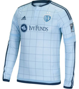
Sporting Kansas City home
In a nutshell : it’s close, but in the end it lacks subtlety
 When I first laid eyes on this kit in an earlier leaked image, I really began to hate Sporting KC for more than just football. First they get that hooped beauty away kit and now they get this graph patterned home kit. Teams you hate shouldn’t look good, it just makes it worse.
But upon further review and a clearer image, this isn’t that great. The pattern is unique but the lines that make up the grid are thicker than they should be. Too wide to be a pinstripe. Add that to the now standard “pajama blue” and it’s dulling to the senses. It feels more like pajamas now than previous attempts. If the lines were thinner or there was a bit more trim with the dark blue, it wouldn’t be so dulling.
Points for taking a chance and trying something different.
Get if : you love graphs, you don’t like feeling awkward sleeping in your kit

Leave a Reply