Disclaimer : I care and because I want to.
Toronto Away
![]()
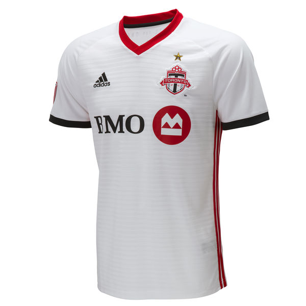
In a nutshell : still white without the red chest stripe
The outside back collar has : All for One
The jock tag position has : a maple leaf
Compared to previous kit : slight improvement

I long for the day that this kit is something wacky. Something truly bizarre. Like green and purple. Or brown. Or peach (you know, done properly Atlanta). Nothing wrong with white, but lets just go nanners.
Until that fateful day of recklessness occurrs, we have a white kit with sublimated stripes in the chest. Dark grey trim on the cuffs of the sleeves, red v-neck collar and red stripes down the sides. I kinda feel like they should’ve inversed the colours of the cuffs and the side stripes (red cuffs, grey stripes), but that’s fine. Not a deal breaker. The sponsor still plays along by having the wordmark match the dark grey, and I appreciate that.
But that star does look nice over the badge, doesn’t it.
If you haven’t heard, if you have last year’s away kit or bought the home kit, you can bring it into the stadium and/or RealSports and they’ll press a star on there for you (but call just to make sure). That’s awesome. No need to buy a new one.
Get if you : Like your white shirts white, like red collars, really have an unhealthy rage-trigger to the colour blue on your Toronto kits and need a change kit.
LA Galaxy Home
![]()
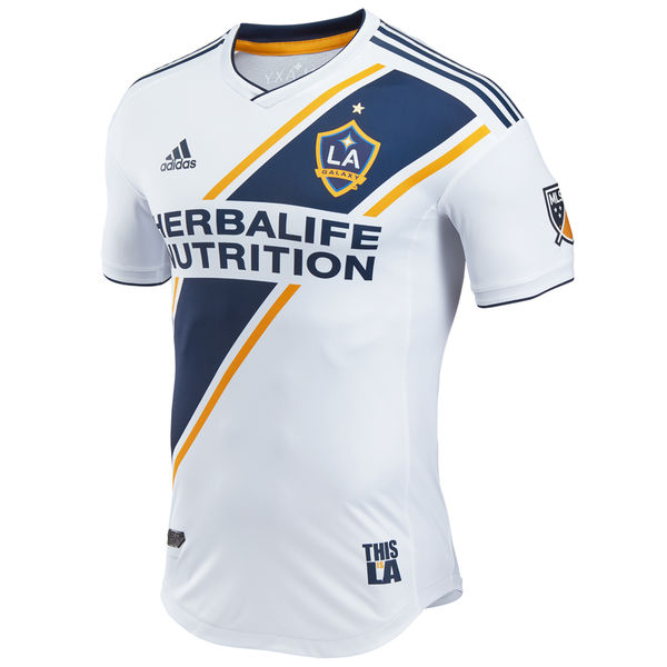
In a nutshell :you swear you’ve seen this before, but it’s nice
The outside back collar has :Galaxy
The jock tag position has : This is LA
Compared to previous kit : lateral move

The new Galaxy home kit has familiarity, but it’s not as you think. Yes, the sash is still intact, it’s still a predominantly white kit with navy sash with gold trim. V-neck white collar with navy trim, navy stripes across the shoulders from collar to top of the sleeve.
The jock tag is particularly amusing to me as though it reads “THIS IS LA”, it also reads “THIS LISA” as the “IS” sits smaller and in a different colour as the “L” and “A”.
Galaxy’s new kit is a bit of a pallet swap of their 2006 home kit, when they were gold and teal, pre-Beckham era.
I dig it. It’s simple, like the angle of the sash. It’s fairly even like for like compared to the last offering and LA will still be one of the best looking sides in MLS.
Get if you : like a nice clean kit, like sashes with trim, weren’t crazy about the last home kit.
Chicago Home
![]()
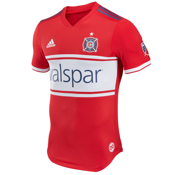
In a nutshell :it’s a clean classic
The outside back collar has :the four stars that appear on the civic flag, the second one being filled in white, others are red
The jock tag position has : 20 Years
Compared to previous kit : lateral move

Like LA is the sash team, Chicago is the white chestband team. If you don’t stray away from that, then I’m already happy. You start at 3 stars.
The Fire home shirt is red, with a red v-neck collar, sleeves are red with white trim, Adidas top of shoulder stripes are navy.
One of the elements that I liked about last year’s kit was that the band was prominent but didn’t feel like a glorified frame for the advertisement. This one does. The band seems wider, and perhaps it’s an optical illusion with the red-then-white trim surrounding the chest band. I could be crazy. It’s not like I have a sample in front of me to measure it *cough*Adidas*cough*hook me up*cough*.
Adidas has been moving towards a bit of a minimalistic or simplistic direction this season, and it’s not a bad thing. (Spoiler alert : not all of them are minimalist or simple)
Get if you : didn’t like the last one for some reason, like wider bands on your Fire kits
Leave a Reply to Mark HSV Cancel reply