
Disclaimer : I care and because I want to.
Philadelphia away
![]()
In a nutshell : Nice, even if the sponsor wrecks it.
The outside back collar has : Jungite aut Perite
The jock tag position has : The snake from the badge
The sleeve has : Union
Compared to previous kit : most definitely an improvement
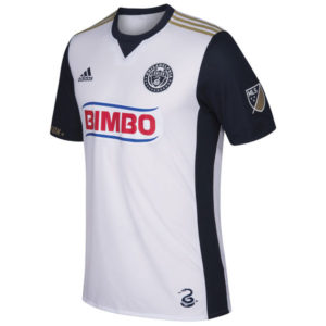
I will always maintain that Philadelphia did themselves no favours by having such a dark dark blue choice in their pallet because it can look black. And by virtue of that, it makes the secondary colour, old gold, pop so much more than a secondary colour should.
But on this away kit, they somehow got it to work.
The white kit has dark dark blue sleeves, dark dark blue ringer collar with stupid v-neck triangle thingie that’s been sneaking into Adidas designs. The top shoulder stripes are old gold. It’s a clean look. The single colour badge is done right here.
I’m taking a mark away for the sponsor. Bimbo should know what design is, especially with such a tragic name for a bread company. Would it trouble them to play along. Either make the red into dark dark blue and the royal blue stripes into the old gold, go completely one colour or at least make the stripes dark dark blue so it appears that they’re trying. I feel it’s a lost branding opportunity.
Get if you : need an away kit but didn’t like past options, like their nicest away kit to date.
San Jose home
![]()
In a nutshell : Black and blue
The outside back collar has : Earthquakes – San Jose 1974
The jock tag position has : SJ74
The sleeve has : Unity Devotion Heritage
Compared to previous kit : Improvement
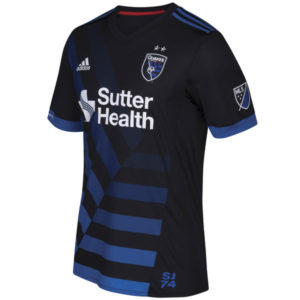
Utilizing San Jose’s symbolism from the badge is tricky because the zipper stripes (my word, it’s not a “thing”) can work for you and work against you.
Last season’s kit felt a bit against it as the zipper pattern was small and sublimated into the shirt. Now it’s front and centre.
You have a predominantly black kit with blue Adidas top of shoulder stripes, blue cuffs, with a black v-neck collar. The front of the shirt does a great job of using the zipper stripes pattern, as it fades out closer it gets to the neck. The design comes across as complimentary without looking off or overbearing.
The red trim on the inside of the collar really feels unnecessary. I know it’s in the pallet, but you don’t have to use the whole pallet (like the KC Wiz did).
Get if you : like your kits to be bespoke, like giant zippers, like to bake in the summer wearing black kits.
Dallas away
![]()
In a nutshell : Accurate representation of night 20 minutes after sunset, I suspect
The inside collar says : The stars at night / Are big and bright
The outside back collar has : State flag of Texas
The jock tag position has : DTID
Compared to previous kit : Not as nice
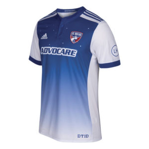
Hey guys, I have an idea for a shirt. You know that song about “Deep in the heart of Texas”, right? Let’s make a kit about the first 2 lines of the song!
And then it happened.
My FC Dallas (yeehaw!) have been sold on an idea that’s questionable at best. We have a predominantly blue kit with white sleeves with blue cuffs, blue button-up ringer collar and blue shoulder Adidas stripes.
And then there’s the front. Blue at the top with stars in the background above the sponsor, then below the sponsor is a gradient from blue to white at the bottom of the shirt. I don’t believe the stars are a constellation, but I’m not up on my astronomy.
It’s not terrible. A case of “I see what you did there” and it could’ve been much worse, but it’s kinda underwhelming once you see the finished product. I do love the shade of blue and the cuffs look super nice.
Get if you : Like stars, but not the championship kind or the flag kind or whatever that “star” is supposed to be on the LA Galaxy badge.
Leave a Reply