
Disclaimer : I care and because I want to.
Chicago away
![]()
Jock tag : waving Civic flag of Chicago
Back of the neck : secondary Chicago fire wordmark letter C in a circle
In a nutshell : you think you’ve seen this before, but this one is much nicer.

Your first instinct might be to think that this is a redo of Toronto’s away kit from two seasons ago, and while you are on to something, you are also very wrong.
This away kit is almost the inverse of their home kit. The all white kit with white v-neck color red Adidas stripes at the top of the shoulder, and a large red band across the chest which has navy blue trim above and below, which unlike the Vancouver shirt, does not wrap around to the back.
I know that MLS has they’re insane policy of everybody having a white kit, but this at least feels deliberate and unique. The MLS crests that are on the sleeves as well as the Adidas logo appear in need of, which gives this kit the appearance of having three distinct colours. It is a very solid away kit, and in the pantheon of shit white kits, this is a stunner.
Get if : you are a fan of the single horizontal stripe like I am, like reverses up your home kit, like to feel special when it comes to away kit designs (for some weird reason, you do you)
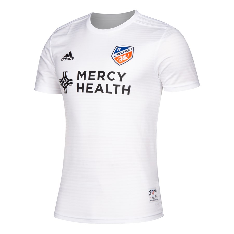
FC Cincinnati home
![]()
Jock tag : 2019 MLS Inaugural Season
Back of the neck : nothing
In a nutshell : templates can look amazing and this is proof.

Everybody gets excited with the hope that their teams shirt will be unique, and I completely understand that. Especially in MLS where most teams have a unique design assigned to them. With FC Cincinnati being new and the Adidas production schedule is typically a 2-year cycle, most if not all new teams will be subjected to a template for the first year. Toronto definitely had it, Minnesota definitely had it and that’s just off the top of my head.
However, Adidas has some absolutely smashing templates. You saw them in the world Cup, you saw them on our goalkeepers last year, and you’ll see it on this home jersey.
This predominantly blue kit has orange cuffs with white trim, an orange ringer collar with white trim, and orange Adidas three stripes sit at the top of the shoulder. The pattern on the chest is stripes, with the stripes containing various thicknesses of diagonal stripes. Up close it may look odd, but from a distance these will look amazing.
Also, Cincinnati’s pallet is incredible. Both the blue and orange are vibrant. It’s the opposite of Minnesota. I do want one.
Get if you : like nice things, love excellent colours in your shirt, like a great first impression.
Houston home
![]()
Jock tag : state flag of Texas
Back of the neck : nothing
In a nutshell : it’s got tiger stripes accept if it was a tiger that was all orange
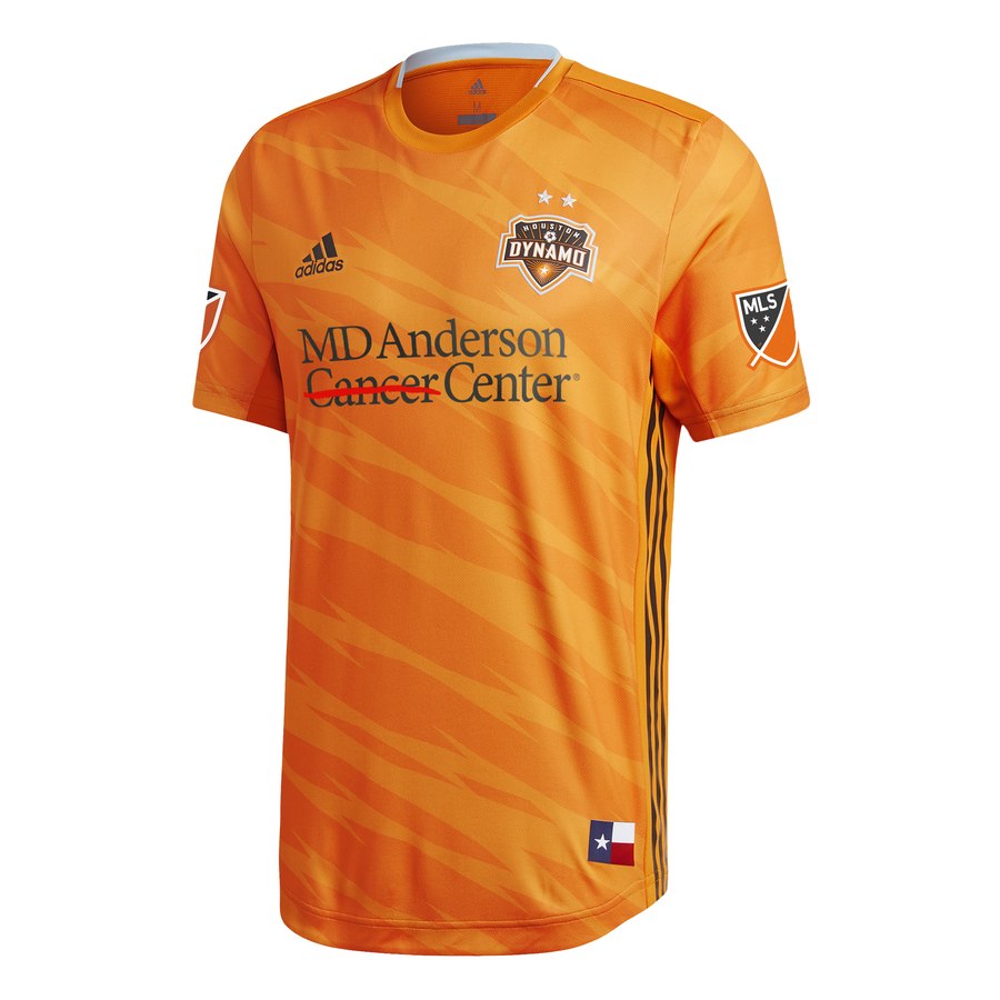
Without looking to compare, this looks very much like the same pattern that Tigres has as their third shirt, except that it’s not white blue and gold, it’s orange and slightly darker orange. and though I do like that their church, mostly because it kind of ties into their name, this is just a pattern for pattern steak. It’s not terrible but it’s a shrug.
The orange kit has a ringer collar in Orange, with their terrible light blue secondary collar as trim in the collar, their not-quite-black not-quite-brown shade appears on the side paneling of Adidas striping that goes from armpit to hip.
The most striking thing about this shirt is the sponsor on the chest. The new sponsor isthe MD Anderson Cancer Center and there is a red line striking through the word Cancer. Accepting that this is their corporate branding and they paid to be on the shirt, seeing the bad word with a line through it keeps bringing a slight smile to my face.
Get if : you like zany patterns, like Houston but not like diseases
Los Angeles Galaxy away
![]()
Jock tag : This is LA
Back of the neck : GALAXY with the 4-point star in the middle
In a nutshell : oddly stripy and blocky and dark
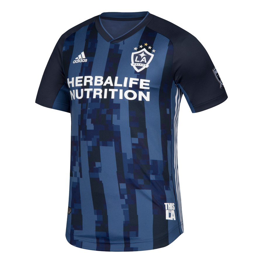
As much as I’ve rarely been a fan of the Galaxy I do love their pallet. The dark blue, the gold and white are brilliant and versatile. This has led to many nice kits over the years.
This offering is a bit odd, with it’s dark blue and darker blue stripes, but then it gets randomly pixelated in large blocks. I’m not sure what it’s supposed to be but I like the distortion and from a distance it’ll have a stronger effect, because up close, it’s very confusing, as in ‘why’. The V-neck is dark blue with a lighter blue striping, Adidas white stripes on the side paneling, all cut in raglan style.
There are five stars over the top of the badge, however the top middle one is gold, and from the images, it’s subtle.
Get if : you like dark blue kits, like stripes, need more clothing that depicts a zoomed in, low resolution jpeg of the sea at night.
NYCFC home
![]()
Jock tag : a pigeon with a map imprint within the bird
Back of the neck : Civic flag of New York City
In a nutshell : the racing stripe surely makes you go faster
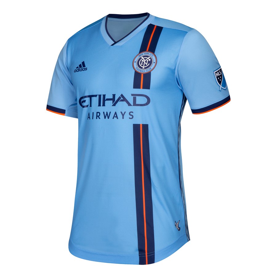
I’ve often felt like many of the unique home kits that have come out of the actual New York side’s offerings have been underwhelming at best, but they’ve got themselves a winner here.
The kit is a seemingly darker light blue (could be the eyes playing tricks on me or some slight Photoshop touch ups at work) than last year is a great base to work from. The chest has a racing stripe that sits under the badge from shoulder to hem that’s mostly navy with a single orange pinstripe inside of it. It’s simple, it gives it that signature customization, and not just another side. Sometimes the design doesn’t have to be a revolution (like that mess your New Jersey neighbours were saddled with).
I’m a fan of adding the orange into the cuffs. Navy and orange pairing has always looked great, the colours are complimentary. How about a navy with orange pinstripe kit for next season? One can dream.
Get if : you’ve been holding out for a nicer home kit, love a good racing stripe (and who doesn’t)
Atlanta home
![]()
Jock tag : gold shape of the state of Georgia with 17 in the middle
Back of the neck : United Atlanta United (really)
In a nutshell : it’s a Milanista’s laughable dream
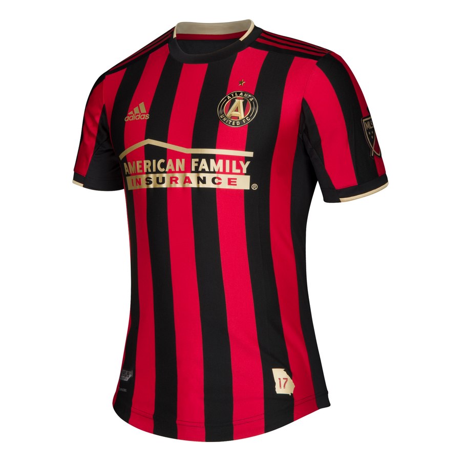
The rossineri five stripes (no, I’m not calling them by such a stupid stupid nickname) former Silverbacks were inevitably going to run into the same problem that Montreal were – eventually they will look like a much more famous side, but it only took them 3 seasons to get there (and Montreal held out for so much longer so you did well).
The kit is red and black stripes on the chest an sleeves. The ringer collar is black with some gold trim, cuffs are black with the similar gold trim. Red Adidas striping appears on a black panel on the shoulder tops. Sponsor and Adidas marking appear in gold.
Trying to put aside my distaste with Atlanta, their supporters (not jealous), their rapid rise (jealous) and inevitable fall (be patient), *sigh* this is a great looking kit. Obvious comparisons to AC Milan, but they’re usually a good looking team and that’s not their fault. Black + other colour stripes struggle to fail.
Get if : you want to buy an Atlanta kit once and only once in your life.
LAFC away
![]()
Jock tag : Rondel with the wing from the badge, surrounded by the slogan “Street x street, block x block, one x one”
Back of the neck : nothing
In a nutshell : It’s got treads. Sort of.
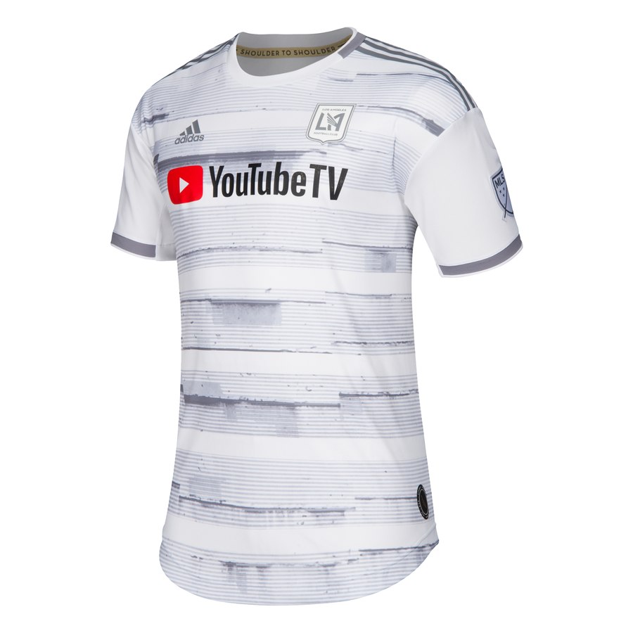
So they’re going to get a similar treatment as the Real Salt Like as though it’s another white away kit, there is an attempt to not be crap.
This kit has dark silver cuffs, half white, half dark silver ringer collar, dark Adidas striping from the neck to the top of the shoulder. The chest has this hooped pattern that looks a little skewed in grey with various shades and thicknesses.
The “sidewalk” pattern isn’t terrible, and I feel like my instinct to crap on this one is tied into the white kit policy, and if there wasn’t 20 white away kits (not counting, past 10 it’s too fucking many) I’d probably be favourable towards it. It looks like a weird offset hopped kit, which I’m kinda into. It’s distinct and from a distance, it’ll look great. However choosing silver as a trim and monocolour lighter silver badge was a very dulling choice, and that sponsor leaps off the chest, so yay for them.
Get if : you like white kits but are protesting the other dull ones, crave that run-over look of your outerwear.
Orlando home
![]()
Jock tag : monocolour white and dark purple civic flag of Orlando
Back of the neck : Defend the Fortress
In a nutshell : purpley gates with more purple
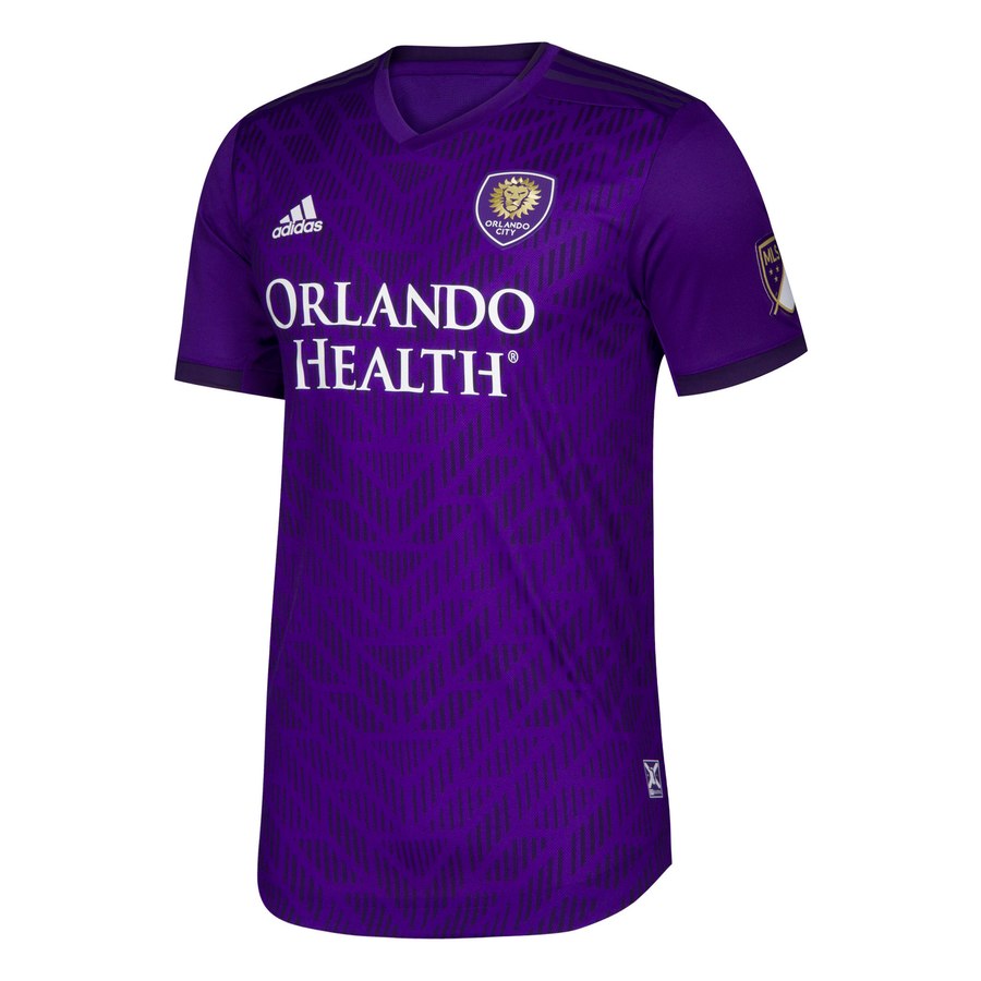
Ok, so I’ve more than once considered getting their heathered kit from last year, because it’s a known weakness and resistance is tough. Going anywhere after that was going to likely be a downgrade, but what they received was very solid.
This kit is purple with darker purple. Purple v-neck, dark purple cuffs, dark purple Adidas stripes on the top of the shoulder. Then there’s the gate pattern on the front of the kit. Apparently it’s a gate as there are promotional photos taken in front of said gate and I cannot tell if it has meaning or not, but as someone who likes a pattern, this works.
And then there’s the remarkable lack of their peanut butter brown. It’s so boring. There was a part of me that hoped the dark purple was a navy or indigo at first look, but I’m ok with this too.
Get if : you like your fencing to be meaningful and worthy of tribute, didn’t care for the heathered look and have $100+ to drop on a home kit, you were as resistant to their shade of brown as I am but like purple.
Seattle away
![]()
Jock tag : subtle black bridge with a mountain backdrop
Back of the neck : Casecades to Sea
In a nutshell : didn’t see that coming.
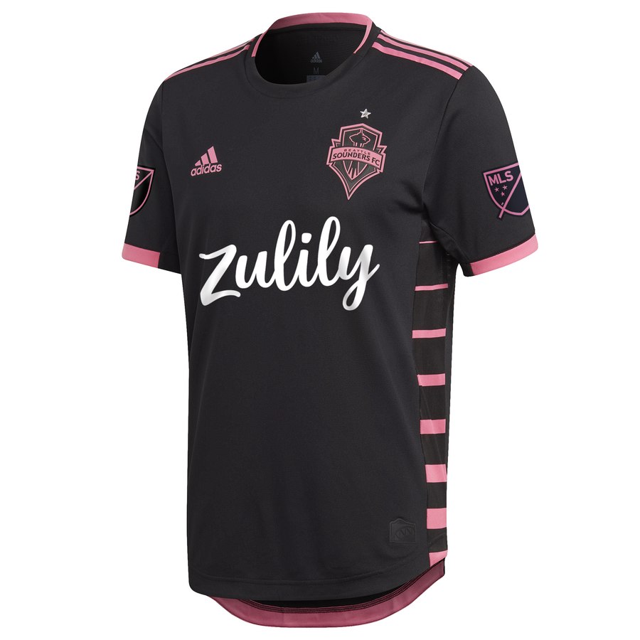
An away kit that isn’t white *gasp!* and has pink *clutches pearls!*, oh the indignity! Blah blah blah think of the children. Whatever.
After all of the phoned in white trash [In this context, I’ll allow it. ~ Ed.] of away offerings, this black and pink one is the veritable ‘heel turn’ of kit releases and it is refreshing. This shirt has a black ringer collar with pink trim, half pink cuffs, pink Adidas stripes on the top of the neck and shoulders. The side panels have horizontal pink stripes, increasing in thickness as it descends to the bottom. The Seattle badge is monocolour pink on black. It’s striking.
If I could’ve made one change to this kit is to have the sponsor colour match the star over the badge. Both elements really pop, but the white is jarring when there’s a light silver/grey on the kit as well.
If you have a problem with this kit, or any kit, having pink on it, it is your problem (see the UN treaty, Bret Hart Convention of 1986, which made pink a badass colour again).
Get if : you’re not insecure about colours, wanted something close to a Hart Foundation kit, you want something a little different.
New York Red Bulls home
![]()
Jock tag : Love, Fight, Passion, Glory
Back of the neck : nothing
In a nutshell : Street wear, sure. Football, no.
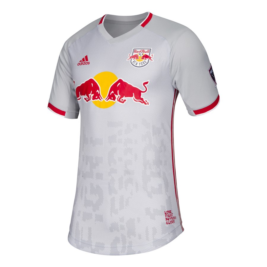
There is so much going on in this shirt, it argues starts at what they were going for. I feel like somebody in the marketing department saw an “urban lifestyle” t-shirt and said hey can we have our shirt look like that. And now the Red Bulls are the Grey Bulls which isn’t a thing.
Here we have a light grey shirt, with some red trim on the v-neck collar, some red trim on the cuffs and red Adidas striping down the sides from armpit to hip. The chest of the kit has a diagonal two-tone grey imprint and the words from the jock tag appear vertically in a distorted font (you can turn your head to read it).
14 year old me might have thought it looked cool, but I am an adult with taste now. This would be ok as a $40 lifestyle shirt, but a kit it is not.
Get if : you always wanted a home kit where the primary colour isn’t in the badge, like your club to be the most dulling side on the pitch, want your kits to scream more fashion than football.
DC, Colorado, Cincinnati away
![]()
Jock tag : I
Back of the neck : Don’t
In a nutshell : Care.
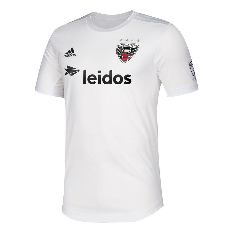

I feel like I’ve done this already. Yeah, I did. So here’s the other three.
Colorado has got a light grey cuffs and sleeves with maroon trim. They put the light grey next to the white… or is it cream colour. If you’re going to try to differentiate with the rest of white offerings, try harder.
In a “hold my beer moment”, DC when full light grey with their trim. I’m pretty sure I can draw this on a white t-shirt.
And then there’s Cincinnati. White with white trim. It’s there and it sucks.
These are not worth your money. Not even close. Every other kit with a rating 2 or higher has had significantly more effort put into it than this. These are listed on the MLS store website at $120 US each. As of writing, that’s $160 CAD each. The Parley kits coming out this season are more exciting than this!
Get if : you collect all your teams kits, are flush with cash and need to buy them all.


April 1, 2019
but but, the white kits are such a clean, fresh look…
the white represents snow, or paper, or emptiness…
barf. they are so boring. Also, TFC’s all red kit this year puts me to sleep. It’s so plain and boring.
Cheers!
April 1, 2019
Not that paying $100+ for a jersey should be acceptable, but if a nice looking shirt is $150, and you might pay $150 for one, would you necessarily pay $150 for a boring phoned-in looking one?
I wouldn’t. And most of these wouldn’t move me at half price.
April 2, 2019
I hope the CPL jerseys are better then these.
Other then the NYFC kit the rest are bargain bin fillers…. at the Goodwill store that is.
April 3, 2019
Time was the Galaxy were the only ones doing the los Galacticos look now everyone is slipping into those pretensions.
April 5, 2019
OK, 5 minute hot take on the CPL jerseys (not enough time to look at them in detail yet):
– I like the Halifax home kit. A lot. Away is a bit weird, but not bad.
– Hamilton home kit looks like a walking Tim Horton’s cup.
– I think I’m generally ok with York 9’s kits. The green is pretty bold. Possibly ugly, but undecided so far.
– Winnipeg is a bit on the dull side, but inoffensive. Might grow on me.
– I’m not sold on Edmonton’s home kit, but the away is interesting?
– I like the sash for the Calvary home kit, but the camo away kit has negated the good feelings I have about the home kit.
– Vancouver’s kits are just bloody awful and hurt my eyes. The home kit has an erect trident sticking up from the crotch. So yeah. Also, and this is probably only offensive to me and a select few other people… but their nickname of “PFC” is the same as a nickname some friends had for a guy back in high school that they really didn’t like. PFC stood for “Penis From Concentrate”. Seeing their kits has brought back that memory and now I will never be able forget it when I hear about this team. But so far I think the nickname make sense actually.
Hope to get a full rundown of your thoughts on these kits!