Disclaimer : I care and because I want to.
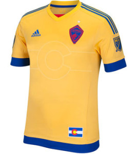
Colorado Rapids away
In a nutshell : This has got some crazy game and it’s smooth like butter
 First off, I am not on medication. At all. This is a wonderful kit.
You can do primary colours, as long as you pick shades that work together, as seen here.
The printing of the Colorado state flag “C” with the sun in the middle and the horizontal stripes right in the middle of the shirt is the first right step. Also, the lack of sponsor.
Also, there’s nothing in the rulebook that says your away kit needs to meet your colour scheme. The away kit was always supposed to be the change kit, the one you wear when your primary kit clashes with whomever you are visiting. With so many red, white and blue teams in this league, we can use a few departures and this one is so positively strange, it’s wonderful. Off the top of my head, the only other club is Portland that has an away kit that doesn’t match their official colours.
See stupid Houston jock tag? This is how it’s supposed to work. You don’t notice the flag because it matches. It belongs there. Not since the Colorado Rockies (the hockey one) has there been a shirt that’s this “Colorado-y”.
My only real strike against it is the badge. The blue and red are fairly dark contrast against the golden yellow. Could they not have put in some of that yellow or white into the badge just to make it pop. With all of the hyperbole of ‘playing for the badge’, making that badge leap off the shirt would’ve highlighted the thing worth playing for. So very very close but still a classic.
Next year, I hope Colorado go full Trabzonspor and own that best team kits title.
Get if : you want a classic in your collection

Leave a Reply