Disclaimer : I care and because I want to.
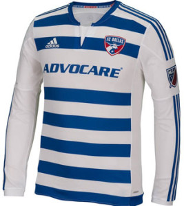
FC Dallas away
In a nutshell : hopefully a sign of a return of the hoops
 MLS baffles me. The redo the terrible Burn into FC Dallas. A wonderful rebrand top to bottom, and even include a nod to the past in the badge. Give them a unique kit, red and white hoops (a.k.a. horizontal stripes) and then spend the next 4 seasons referring to them as “the hoops”. Now I’m not sure what prompted the change, but last season “the hoops” lost the thing they were named after on their home kit. Well here’s the away kit. And these hoops look very nice. I haven’t seen Adidas offer up a hooped kit in a while (they’re probably out there, but the last one that came to mind was Sporting Lisbon… sorry, off track).
Is it a little QPR-ish (from two season’s ago) with the thinner tighter striping? Sure, but that doesn’t make it bad. These
Get if : you like the future and where it’s heading, like hoops but weren’t crazy about having grey trim around the hoops from the last offering, want to be QPR in disguise


March 8, 2015
You guys are taking all the excitement out of seeing them for the first time on our stream or TV.
March 9, 2015
you forgot the *SPLODGE* at the end of it Mark!! Which young Canadian are you getting on the back of this?