The others have no idea that I’m doing this, so here it goes…
Are you a football fashionista? You like your kits stylish, progressive, clean, crisp, (or as the kids say) sick? Well if I was wealthy, I’d own all these new bits of kit. But since I’m not… (pause for the gasps to die down)… here’s what I think are some nice shirts that you may have missed.
So here’s what I like.
- Stripes/hoops/quarters/sashes are all above board.
- Sponsors that try to blend into the shirt. Yes, ideally there wouldn’t be one but beggars can’t be choosers.
- Strong colours. Not a fan of pastels, typically.
- I’m a fan of certain brands, but not limited to just them. I’ll give anyone a shot.
If your team isn’t on here, assume I hate them with the fire of a thousand suns, but the reality is I probably don’t rate it worth mentioning.
It’s probably in no particular order, but I’ll admit my biases. Also, I like a pile of teams, or “a horse in every race” for many random reasons. Choose to agree or disagree, but these are my opinions.
Girondins de Bordeaux 3rd
![]()
Manufacturer: Puma
In a Nutshell: Deep red with navy stripes.
Club shop link to save you the trouble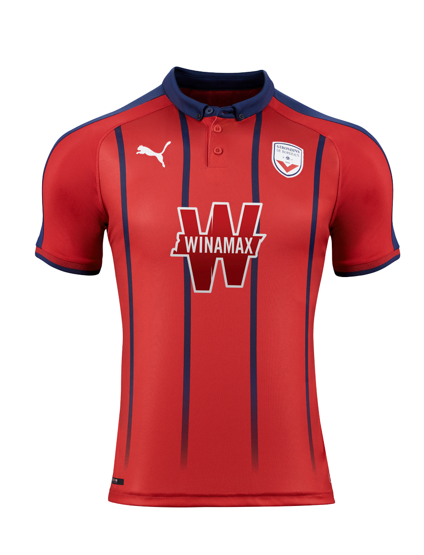
If you were to go down the line of home, away, and third, Bordeaux’s kits progress from each kit. The navy kit is nice, the pink one is nicer but the third one is stunning.
Avoiding obvious wine references, it’s a predominantly deep red with thin navy striping, fading as it reaches the bottom of the shirt. A classic navy collar with a few buttons fancy the crap out of this beauty. Thin stripe of navy on the cuff, back neck features 1881, and the badge has been modified to match the dark red. Minor gripes would have to be that the striping does not continue on to the back, the leaping Puma could’ve been navy instead of white, but it’s easy to overlook.
Get if : you like your kits to compliment your pinot noir, like your kits to scream Provence.
Wycombe Wanderers Home
![]()
Manufacturer: O’Neills
In a Nutshell: heathered quarters are nice.
Club shop link to save you the trouble
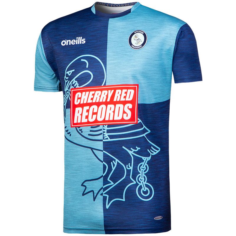 Light blue and dark blue combinations are difficult to screw up. So are quartered kits. Bring them together, and you’re already ahead. Also, heathered patterns. I have a weird love of heathered looks. I bought Manchester United’s away blue heathered kit a few years ago. I was stalking Eintracht Braunschweig’s away blue heathered kit last season.
And now Wycombe Wanderers have done it.
If that setup didn’t explain it, here’s the culmination : Oxford and Cambridge blue heathered quarters, with the large swan from the badge in two colours, inverse wherever it appears on the shirt. The back, also quartered, features a stylized “Founded 1887” on the lower right. Ringer collar that is dark blue at the front and back, light blue on the sides.
I’m torn about the sponsor and here’s why : it’s sticks out like a damn beacon BUT it’s a record company. And records are cool. Cherry Red Records leaps off of the chest. For style, it’s bad, but it is a cool sponsor, and style wins out, thus it’s only knock.
Get if : you love the heathered prints like I do.
Hibernian Home
![]()
Manufacturer: Macron
In a Nutshell: As nice as kit as hibs has had in years but better
Club shop link to save you the trouble
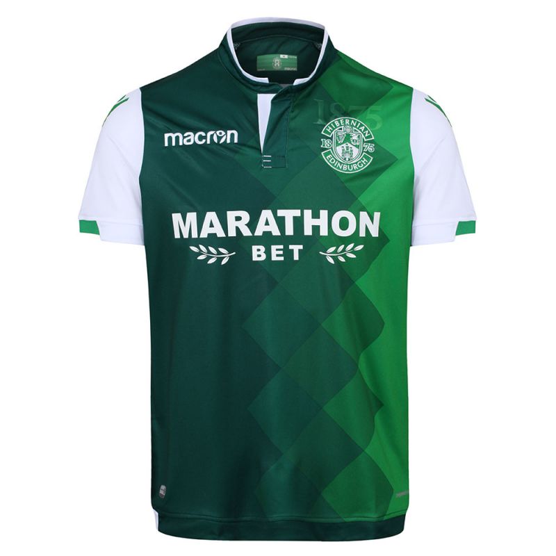 Macron is the best. Their phone-ins are nicer than so many other bespoke kits. If they had a kit subscription service, I’d sign up immediately and I’d be broke.
On the front of the kit, is a stunning diamond pattern that transitions from “bottle green to emerald green” (so says the club shop description) and I can’t stop staring at it. The sponsor plays along by being in white. The back of the neck has “Glory Glory” imprinted, the gradient diamond pattern from the front is repeated on the back. The sleeves are white with the Macron person-icon in green and the cuffs have a green flash on an otherwise white trim. The collar looks like a sorta turtle neck with a button at the top.
Get if : you like nice things, believe it goes back downhill from here, haven’t considered updating your Hibs wear in a while.
Dynamo Dresden Home
![]()
Manufacturer: Craft
In a Nutshell: Golden simplicity and style
Club shop link to save you the trouble
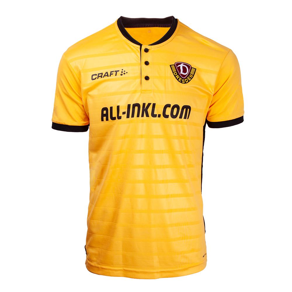 So, my first reaction was this is super nice for a Bundesliga 2. side. My second reaction was who the f*ck is Craft? Craft, as far as I’ve seen, also makes the shirts for Darmstadt, but screw them, this is about Dynamo Dresden and this lovely bit of kit.
Black ringer collar with three black buttons, sleeves match the kit with black cuffs. The front of the shirt has sublimated thin hoops, but don’t repeat on the back. There are the phrases of “Wir haben einen Traum” (we have a dream) on the back neck, inside collar reads “Love Dynamo – Hate Racism”. There appears to be a thin black stripe along the seams that join the front and back panels of this shirt.
Get if you : want a nice shirt that’s a conversation starter where you could make shit up about its history and totally get away with it (14 East German First Division titles! You could wikipedia that, and so could the person you tell it to, but they won’t as it’s plausible – and the answer appears to be 11), you love black and gold kits (and who doesn’t).
Feynoord Away
![]()
Manufacturer: Adidas
In a Nutshell: One of the best uses of a template
Club shop link to save you the trouble
 I’m so pleased with Adidas and where their templates have evolved to. They’re finally decided to figure out how to manipulate their stock styles for the season and make them even the slightest bit bespoke. Case in point is this season’s Feynoord away.
This sea-blue color (it’s not green, it’s mostly blue) templated kit is quite striking. You’ve seen this template at the World Cup, and you’ll see it a pile this season. But what makes this template kit very nice is the Adidas shoulder striping. Red on the right, white on the left. Something so simple makes it unique. It makes it theirs. Ringer neck collar in the same blue, the sponsor is white, so it’s not annoying, while a tad large.
Get if you : like blue kits, like fancy shoulder striping, really don’t want the home shirt though there’s nothing wrong with it.


October 24, 2018
Out of those kits, I’m liking the Hibernian one, and the Wycombe jersey is interesting too!
If you like Bundesliga 2., what do you think of St. Pauli? Their home kits are always brown, ha ha. But I went to Germany in 2010 and bought their amazing 100 year jersey, which is reversible – the inside consisting of a collage of the team’s history. They made it to the Bundesliga 1. for 1 season that year, and the league let them wear the reversed (sponsor-free) jersey for their derby against city rivals Hamburger SV (my main Bundesliga Club – hence the HSV in my handle). Anyway, check it out:
https://i.pinimg.com/originals/6b/65/ab/6b65ab98bb5d24856136e0613027df53.jpg
October 24, 2018
That is amazing.