Disclaimer : I care and because I want to.
![]()
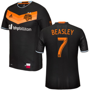
In a nutshell : Almost like a negative of the Germany World Cup kit.
The inside collar says : Forever Orange
The outside back collar has : Dynamo
The jock tag position has : Flag of Texas
The side Adidas stripes are : dark grey
Oh Houston Dynamo. I hate your pallet. Why haven’t you just written off the crappy dulled sky blue out of your badge? Worse yet, why do you keep using it?
The shirt is a bit ordinary, which isn’t a bad thing. Black shirt and sleeves with a three-tone orange chevron a bit below the ringer collar. The manufacturer and the monotone badge black within the orange space. The trim is that stupid dulled sky blue from the badge. It’s so faint it looks like the dye ran and then they tried to bleach it out but it didn’t work. It looks like a mistake.
Should’ve replaced it with white, or the dark grey from the side striping, or any of the three shades of orange.
The jock tag looks really out of place on this one, moreso than the rest of the league. First off, why are they using a state flag when so many others are using civic ones? Secondly, there’s another team in Texas, with a third one on the way (San Antonio is totally happening). Third, the flag is navy, white and red on a black and orange shirt. Chicago has theirs embossed into the shirt. This would’ve been a good idea to follow.
Lastly, I hope that they do not do the stupid thing where the home team wears their road kits for marketing reasons. I’d hate to think that the sales of a shirt come ahead of a team in very warm Houston wearing an all black kit in a summer sun. That would be extra dumb.
It’s not a terrible kit, and it is an improvement on their terrible gradient kit from last season, but within the details is the downfall. Also, white sponsor on a black kit is pretty blatant. Couldn’t make that orange too?
Get if you : like black shirts, like to suffer in the sun, like large chevrons on things


February 25, 2016
Or the Umbro shirts from a couple of years ago. I do like the colours for a cool weather climate.