
Disclaimer : I care and because I want to.
![]()
In a nutshell : The nicest kit in MLS.
The inside collar says : nothing
The outside back collar has : SKC
The jock tag position has : nothing
The side Adidas stripes are : a deep sky blue (it seems) 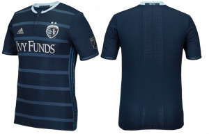
I thought Vancouver or DC might have locked up this ‘best new kit’ thingie, but this. THIS.
First off, f*** you Sporting Kansas City Wiz. I don’t like your team, I don’t like your name, I don’t like your badge, or many of your players, past and present. The only thing I like about this team is year one – with a beyond stupid name and beyond stupider kits (I know “stupider” isn’t a word, but I’m on a roll).
Secondly, f*** you Adidas. How dare you give them TWO nice kits consecutively. So nice, I almost want to buy them, if only to stare at them on a wall in perpetuity.
Lastly, f*** you Sporting Kansas City Wiz. You still have stupid ugly home shirts for your stupid ugly team.
*exhale*
Now I’m beyond jealous. I’m officially super jelly.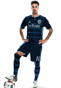
Where do we start with this beauty. Midnight blue kit with slightly lighter navy blue thin hoops (much thicker than a pinstripe) on the front of the shirt. Sky blue mandarin collar and buttons down the front. The same royal/aqua blue appears on the obligatory Adidas side stripes. Navy shorts, navy and light navy hoopy socks.
Spectacular. Sometimes, as much as we rant and rave and rant some more, I want nice things for Toronto FC. I want something like this.
Get if you : somehow thought last year’s away kit was “just not nice enough”, like to look awesome and have people stop you and ask polite questions, are impartial and dress well.
Leave a Reply