Disclaimer : I care and because I want to.
Montreal Impact away
![]()
In a nutshell : a little jealous
 Well, Montreal is two for two in the “envious of their kits” department. Their blue and black striped kit is still a beauty, and this is quality for an away kit.
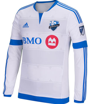
As you may or may not know, the fleur-de-lis is to Montreal as the maple leaf is to Toronto. The fleur-de-lis shows up in three different places : within the badge, imprint along the pinstripe outside of the hoops and on the back below the collar. This makes far more sense than the leaf belonging to Toronto. A little overkill? Perhaps, but I’ve never known a Montrealer to be tired of it.
Though the faded light grey hoops on the front of the kit very closely resemble the exact same pattern of (my) FC Dallas from two seasons ago, which is a bit of a cop-out. The pinstripe outside of the hoops are kind of unnecessary. Still looks great.
I’m a fan of the bottom blue and sleeve cuffs of the kit. Very classy.
Get if : you like road trips, want a great complimentary kit to go with the blue and black striped kit
Leave a Reply