
Disclaimer : I care and because I want to.
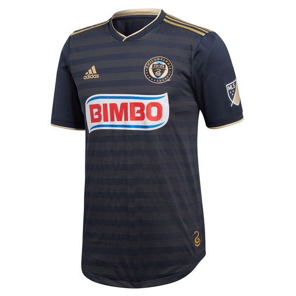
Philadelphia Home
![]()
In a nutshell : the bib is gone
The outside back collar has : Join or Die with a snake
The jock tag position has : coiled snake
Compared to previous kit : an improvement, but different
Some of my concerns with the colours that some clubs use is that their choice was short sighted. Yes, it looks nice on a website or letterhead or business card, but how is going to look on a jersey on the field? Under the lights?
Philadelphia is a prime example of that. Their kits rarely look navy. They look black. And that’s ok, except it’s supposed to be navy. They recently updated their crest, and at first glance, the made the gold brighter and lighter, which is a solid move. But the navy appears to remain intact.
So they removed the bib. This was a good idea, if only because the lighter golden bib would have made the navy part of the shirt appear darker. Now we have sublimated thin-ish hoops in the pattern of the fabric. Minimal gold trim. Updated badge. But the sponsor still doesn’t play along and it doesn’t do this shirt any favours.
Get if you : hated the single wide stripe down the centre, like more navy and less gold, like the sublimated hoops
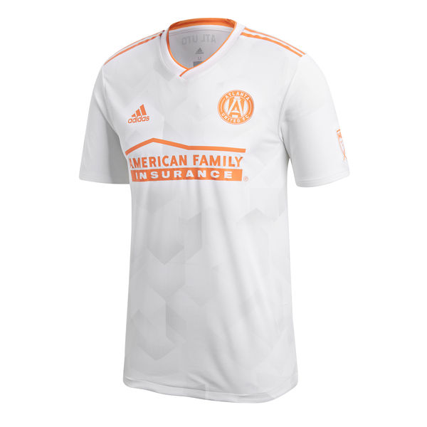
Atlanta Away
![]()
In a nutshell : It’s white with peach
The outside back collar has : ATL UTD
Compared to previous kit : Slightly more interesting.
I imagine a boardroom situation :
Hey guys, I have an idea, let’s go with something that’s iconic for an away kit idea. How about we pay homage to the Georgia peach!
Fantastic idea, we can have a white kit, with peach accents, great idea!
No that’s not what I meant…
And that’s how I’m sure it went down, a good idea that got snuffed out.
Here we have a white kit with peach trim.
There’s a hexagonal imprint design on the chest. Peach trim cuffs, peach Adidas stripes on the shoulders, v-neck collar with peach trim. It’s ok. At least the sponsor played along.
Screw it, let me fix this :
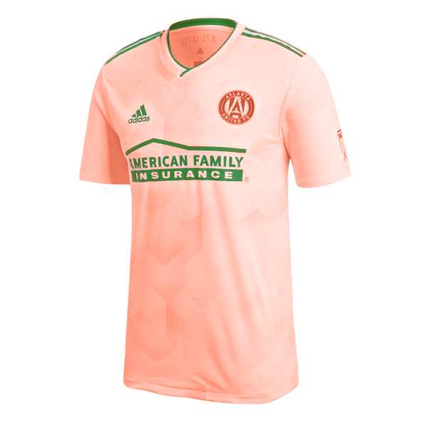
Now it’s actually a peach kit, with a darker peach badge, and green trim. You’re welcome. 4 out of 5. *sigh*
Get if you : need more things with minimal peach in your wardrobe, like disappointing launches.
Seattle Home
![]()
In a nutshell : at least it’s not camoflauge
The outside back collar has : You Will Hear Us
The jock tag position has : Alliance 10 Years with a laurel around it
Compared to previous kit : not as nice but ok.
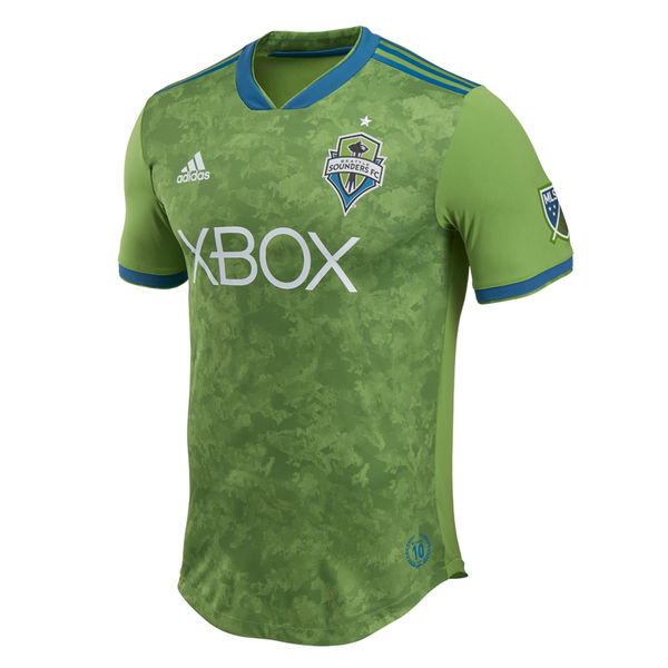
Full disclosure, I don’t hate it. The main reason why as you can only do stripes and logos so often, and it’s ok to change it up just don’t be too mental about it.
The new offering is green with blue thick-ish cuffs, blue v-neck and the Adidas stripes at the top of the shoulder. The chest looks like sponge dabbing paint on a wall. It’s different. It’s unique. It looks like camouflage but it’s not. At first glance, it looks like a densely packed kale display at an upscale grocery store. Probably fair trade too.
Many people that’ve spoken to have cringed and poo-poo’d this kit, and that’s OK. I understand why people might not like it. I see it. It just doesn’t bother me.
Get if you : like to rep your veganism/vegetarianism, like to hide amongst the produce, wanted less blue in your Seattle kit.


February 23, 2018
Sounders appear to have gone the full Master Chief. Jesus.