Disclaimer : I care and because I want to.
Philadelphia Union away
![]()
In a nutshell : Why bother trying.
Philadelphia have been on a slippery slope downward. Their first away kit was a decent reverse of the home kit. Their next kit was their home kit under brighter lights.
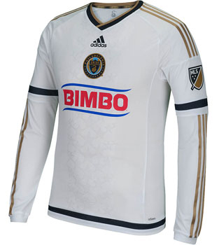 Then this happened.
It’s so ordinarily white. The navy trim is so dark it looks black, and it looks super boring on there with the old gold stripes. This looks like some one-off charity kit or a bad all-star shirt than something that should be worn on the regular.
I’m not against sponsors but would it kill them to have one edition of the sponsor that at least tries to go with the colours of the kit? Or maybe even make the kit the colours of the sponsor (not that many would’ve noticed).
And what is with the inset stars? I do not get the necessity of using the stars when there’s a giant visible snake on the badge. Snake scales would’ve been infinitely sharper in that space, but that would have taken some legitimate imagination from the people in charge of churning this out.
Get if : you like to collect them all, need more shirt options with sublte star motifs, like ugly things.
Leave a Reply