Disclaimer : I care and because I want to.
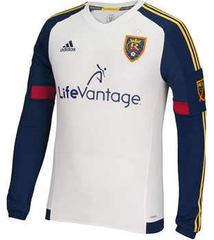
Real Salt Lake away
![]()
In a nutshell : fits the colour scheme, nothing remarkable
 This has to be a marketing manouvre as it seems like over half the league has a white kit, with eight of them (new ones anyways) being away kits. Throw another one to the pile.
The new RSL away kit is fairly ordinary, however credit needs to be given for the navy sleeves with the red swatches and the gold stripes. Doesn’t feel phoned in, which so many of the away kits do. Has all of the obligatory accessories that come with MLS kits, some slogan on the inside collar, something on the back. The custom coloured MLS patch on this really looks sharp. Perhaps because on a quick glance, it looks fairly similar to the RSL badge on the chest.
Get if : you are against the home kit.
Leave a Reply