
Disclaimer : I care and because I want to.
![]()
In a nutshell : It’s Spain. Well, mostly.
The inside collar says : “Believe”
The outside back collar has : Lion head with a crown on it
The jock tag position has : A representation of one of the stadium stands reading “Real Salt Lake” in the seats
The side Adidas stripes are : gold 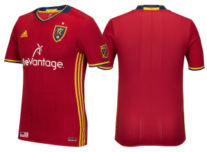
I don’t know which one it’s supposed to be, but it’s clearly Spain. If it wasn’t clearly Spain in previous years, then I don’t know how I missed it, but they’re wearing a rejected Spain kit.
It’s a red shirt, with red sleeves with navy and gold trim, and gold side striping and embossed thin striping in the fabric of the shirt (thicker and more spaced out than Toronto’s current home kit). The collar is navy with a shallow V-neck with navy and gold trim. The “collar” does not appear to be a proper collar, but the pattern of a collar sewn into the shirt. Man, I hope that’s wrong and I just haven’t seen a photo that shows that it’s otherwise. It looks far too flattened into shirt to look like an actual collar. Shorts and socks are also red with gold Adidas stripes.
It’s not a bad kit, but RSL has always been the “red and navy” team in the mind’s eye, and there’s so little navy, that feels like a step away from their identity. That being said, that ridiculous yellow paint stripe across the chest from last year is gone, so big step forward!
Get if you : want to support Spain without buying a Spanish kit, didn’t like last year’s kit and want a new one.
Leave a Reply