
Disclaimer : I care and because I want to.
![]()
In a nutshell : You should never have a classic away kit, but, hey, look! There’s one now.
The inside collar says : “Unity. Devotion. Heritage.”
The outside back collar has : “Quakes”
The jock tag position has : “SJ 74”
The side Adidas stripes are : white 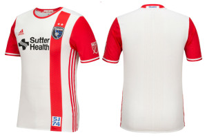
I was not a fan of the San Jose home or away kits. They were boring with a zipper/zebra thing that’s representative of fault lines. Whatever. I like patterns, but the pattern did nothing for them.
And my, how a year has changed.
What was a forced hommage to the original Earthquakes (who wore red and white), they’ve finally put this to good functional use. White top, red sleeves. Simple and straight forward. But then, you have this red vertical stripe that goes down the left side of the shirt, aligned with the badge, and in there is where you find the zipper/zebra pattern thing. And it pops. And it’s subtle. And it’s class. First kit that doesn’t have a V-neck but a red ringer collar, obligatory red adidas stripes down the sides, they absolutely nailed it.
And they put a tiny San Jose Clash inside the collar?!? I’m surprised MLS acknowledges it’s dated badges and names from the long-long ago. Very nice and very classy.
Originally, it was a 5 out of 5, but a few things bothered me, and separately I would’ve let it slide, but collectively it was enough to lose one point. First off, the sponsor is in black. Really? Couldn’t get that in red? OK, fine it’s a pass… but the badge in blue and black? I know, I’m nit-picky, but I’ve seen a few clubs do this already and it makes me hopeful for the trend to continue, but it’s a badge. It’s supposed to mean something. Sure, it’s a pass… but you have that stupid SJ74 tag at the bottom of the shirt. In the beautiful red vertical stripe no less in a blue font? That’s it, point deducted! No, the Earthquakes weren’t anything for 6 years, there was no continuity. I’ll give you the theft of the club and moving it to Houston for the 2006 season and giving them an expansion team that resumed in 2008, but you don’t get a pass from 1988 to 1994. </rant>
I’m sorry, where was I?
This is as close to a great away kit as any club should have.
Get if you : want a new San Jose kit that is actually nice, want a new San Jose kit worth of “The Chad” Chad Barrett’s name and number on the back (Duncan’s quality idea – totally worth stealing).


February 19, 2016
I hope you are going to do the new Columbus Crew kit. Yeesh!
February 19, 2016
Do You Know the Way to….