
Disclaimer : I care and because I want to.
![]()
In a nutshell : Navy noise (it’s like white noise, except, navy-ish)
The inside collar says : nothing
The outside back collar has : nothing
The jock tag position has : seal of Seattle
The side Adidas stripes are : light blue 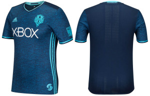
Third kits are a strange phenomenon, especially when they’re made to look “nice”. Typically, a club has a third kit for that rare emergency where everything clashes with whomever they’re visiting and you need to break out this one kit. Usually flourescent yellow or purple or green – an uncommon colour.
As a utilitarian at heart, I get it if your home is red, and away is blue, but you happen to have to play Crystal Palace… break out the flourescent kits.
Seattle is a green and blue team with a white away kit. I’m not sure who they’re ever going to clash with.
If it isn’t an emergency clash kit, then it’s a cash grab (or just bin the white away kit).
Deducting a point for an unnecessary third kit, it’s actually kind of nice, even if it is a little… noisy.
Dark aqua blue with slightly lighter blue to make the pattern of the shirt and sleeves. Light blue trim, side stripes and monotone badge. White appears in the form of manufacturer logo and sponsor.
Get if you : like your kits on the side of casualwear, like kits that – in theory – rarely get worn
Leave a Reply