Disclaimer : I care and because I want to.
Why not another series of awards? Who doesn’t like nonsensical awards based on one persons’ opinions? Why not another rhetorical question to lead off a segment?
With the emotional roller coaster that was the MLS season of 2015 well in the ground, it’s time to look at the shrouds of the corpses of the year gone by. Reflection is a wonderful tool when it comes the visceral reactions to almost 10 months ago that was “Kit Weak (TM)”, and seeing the offerings in its various forms : on supporters, on the pitch, on TV and on a hanger. Some of my opinions may have wavered and, to be fair, they may not even make a lick of sense.
Full disclosure : I like stripes and hoops, thick and thin, strong and/or complimentary colour pallets, subtle doesn’t necessarily mean boring and infographics with explanations are useless to me.
That being said…
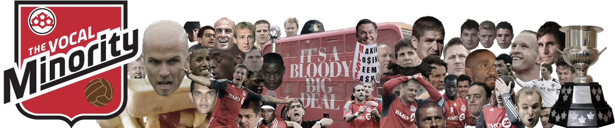
2015 Best Jersey
Criteria : it’s a nice looking shirt. You could wear it to non-footy related events and it is not an eyesore.
- Sporting KC away. I’m still upset because this is a great looking shirt. It’s just on a team I have a strong distaste for. I’m a fan of any kit with alternating colours, and Adidas just nailed this. It’s so nice. If they had just given it the sky blue sleeves, this could’ve been a home kit design forever. Then I’d be truly torn because they would have one of the nicest kits going and I’d still hate them with a driving passion. The striping on the hoops isn’t too thick or too thin. A stunner.
- Dallas away. I know, “again with the hoops”. Would’ve been first, but the hoops are thinner than what I would deem as ‘optimal’, but still a nice kit. Shame also that this is the away kit, since Dallas has been calling themselves the ‘hoops’ since the new name and it technically only appeared on the away kit.
- Montreal away. Yes. Hoops again, but it’s very subtle. The royal blue trim is just enough to be prominent, but not overwhelming. I’d take a point off for the red circle from the sponsor.
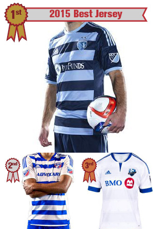
2015 Best Full Kit
Criteria : It’s a good looking complete outfit – shirt, shorts and socks. Colours and design compliment one another. Looks deliberate and not just a random selection of terrible templated looks (which they are, anyways…)
- Colorado away. Oh, buttery goodness. Had the pleasure of seeing them wear this set when they visited Toronto this season and they looked great. Like “I think I should buy one” great. I can’t get enough of this look and they should consider making this their home. Sure, they look like Sweden and we spent a few minutes trying to think of club teams with yellow tops/blue shorts, but the shades worked well. I would’ve tweaked the badge a little and maybe put red tops on the blue socks, but still the best single full uniform in the league.
- Red Bulls away. Dubbed the “Sunoco” kits, these are sharp. Nice contrast between the navy tops and socks and the yellow shorts. It is widely believed that though the primary colours together often look good, they are rarely used. About the only thing I like about when Red Bulls show up, they gotta wear this beauty.
- Seattle home. Though their colours are very unorthodox when it comes to footy in general, the Sounders (typically) look good. The vibrant-yet-dark blue goes well with their bright green and the trim on the shirt compliments. Shorts just make the shirt look even better.
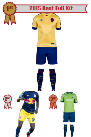
2015 Best Looking Team
Criteria : Home or away, they look good. Talent within the kits is optional.
- Columbus Crew. This is the gold standard of what a re-brand in football should be anywhere. Radical departure from the original badge, maintain colour scheme, give it some class and keep it simple. The Crew is the best looking team in MLS and wouldn’t look out of place in higher profiled leagues. The uniforms are inverses of one another, yellow with black trim at home, black with yellow trim on the road. Also, love the checkers in the fabric of the kits. I am sad to hear that the black kit is going to be their new home kit. Might not be the smartest idea in a summer league, but don’t let practicality get in the way of a dollar or the price of a kit.
- LA Galaxy. Still dig the blue sash on the white kit. Really like the midnight blue with gold trim away. A strong pallet to play with. Adidas is due to screw this up and 2016 is an entirely new opportunity so…
- Toronto FC. Though I’ve never been a fan of the co-opting of the maple leaf and its usage in kits, from a distance, it’s a solid respectable tandem. The home shirt has grown on me and the away shirt still looks better afar. As a tandem, they look like a classy football team. Shame about the differences in photos and video.
2015 Worst Jersey
Criteria : Ugly, embarrassing, something you’d gift to someone you do not like (which begs the question of why you’d gift it at all).
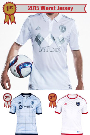
- Sporting KC 3rd. I nearly forgot about this ass-backward mistake but it is a howler and a half – and I couldn’t be happier with who has it. Whomever thought the idea of having a white kit with silver trim needs to be fired and silenced. This has to be the first kit aimed at the stereotype douche supporter. If you’re going to bling up a kit, stop. Sell this as a golf shirt or some ‘lifestyle’ pseudo-marketing-termed outerwear but why anyone should endure elements that will reflect light, player or supporter, is just careless. Don’t care why, should never have done it in the first place.
- Sporting KC home. That’s more like it. I’ve never been a fan of wispy pastel colours, and this has it all over. Mix in this weird graph-paper striping mess and it looks like a pajama top. Pajamas are for sleeping, not for playing in. It gets a mark for trying something different and sticking your neck out a bit, but it’s a terrible looking shirt, and given what other kits they have on offer (well, the hoopy away one), this is a shroud of disappointment.
- San Jose away. Wow. So boring. Worse is that it is an homage to the old Earthquakes kit. Ummm, barely. It’s not. It’s sad.
2015 Worst Full Kit
Criteria : In a league where everyone has bespoke uniforms, you should not have ugly uniforms – and, yet, here they are.
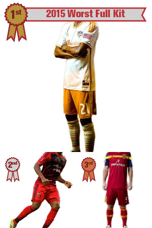
- Houston away. The creamsicles may have it rough with their gradient home tops, which isn’t terrible, but their away one is just so boring. Their colour pallet is crap to begin with (orange with faded weird cream light blue and really dark reddish-brown) so there isn’t much to work with but this is super boring. The orange shade is so light, it makes the US flag patch on the arm and the Texan flag patch at the hip look tacky and cluttered. I don’t know what could’ve made this better other than not having one at all. I have a very “WTF” reaction to this whole kit. Uninspiring and sadness.
- Portland away. What is with the gradients? It can be done well, but does it always have to go from something to white, or in this case, something to black? I get the red/Rose City thing, so keep that, but this feels thoughtless. Just go flat black. Or pinstripes. Or not this.
- RSL home. That brush stroke gold band that goes from upper arm to upper arm across the top of the chest. It feels like they had a quality idea, and an eight-year-old from art class just ruined it. Don’t care what the infographic said, it’s a bit of vandalism. Then it gets ordinary from there.
2015 Worst Looking Team
Criteria : Someone has to be the worst. Uninspired, awkward looks no matter where you play.
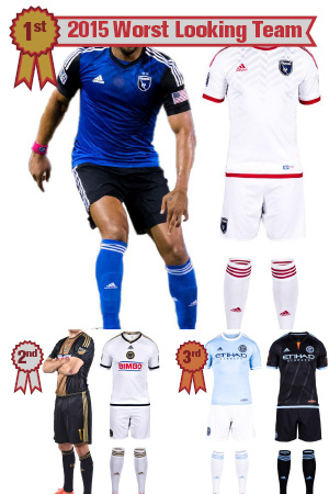
- San Jose. Nothing about this screams excitement. Nada. Nil. The home kit could’ve been better if they eliminated the white trim and went with red. Or blue on black, then black on blue. Then there’s the snoozefest that is the away kit. Without a sponsor, they had a canvas to make a classic, but I’m not feeling it in any way shape or form. Sure, the weird zebra/zipper thing is on the embossing of the shirt, but I wouldn’t call that a plus either.
- Philadelphia. This is nearly a tie because this is an ugly club. Sure, I’ll submit to the golden bib stripe, but that navy is so dulled, and then you add the old gold. I fully understand branding guidelines, but when you cannot stage a photograph for a shirt and fake it to look a little better than it actually is, ugh. The away one is such an afterthought of just white. And take a few more marks off for the bright red sponsor in the centre of both kits. Just tragically ugly.
- NYCFC. The home kit is uninspiring. Terrible shade of light blue but using navy for some of the trim salvages a bit. The away one could’ve been OK, but there’s that orange triangle thingie in the collar. I get there’s orange in the city flag, but there’s also royal blue, which is absent and more complimentary. And 5 diagonal thin stripes to the boroughs is poor. Why diagonal? Why thin? This is supposed to represent the biggest city in the US and it symbolizes a mess. A “big apple” would’ve been less terrible, (but just as laughable).
Well, this has been a wonderful gala event. I’m glad that you could join us for the 2015 Kitties here at Vocal Minority. Got any opinions? Throw them down below. Good night (or whatever time of day you choose to read this)!


January 12, 2016
And San Jose’s kit was just redesigned before this season, right? What a disaster.
January 12, 2016
nah. no sponsor, and as of this coming season, Chad Barrett, that’s THE must have shirt of 2016!
January 13, 2016
So the “Borussia Columbus” look is the Best Looking Team”. l can live with that, but I have my reservations about the Galaxy’s “Miss America” sash look. North America’s Galacticos look best in straight-up white.