Disclaimer : I care and because I want to.
I love awards. In fact, my favourite type of awards are about niche topics from unofficial sources written by someone who has a horse so high, it’s a struggle to get on it at all, so I’m doing this for me, and you can choose to ignore it.
That being said…
2016 Best Jersey
Criteria : it’s a nice looking shirt. You could wear it to non-footy related events and it is not an eyesore.
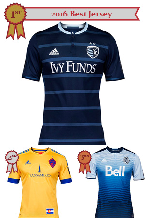
- Sporting KC away. Seriously, damn you Sporting KC. Teams you despise shouldn’t have nice kits. They should be tragic. Shameful. Instead you have this midnight blue kit with horizontal lighter blue stripes. I like this shirt so much, I’m going to get one and if I had an Adidas contact, I’d get one without the badge or the sponsor just so it would be perfect.
- Colorado away. This is so different to what I would expect as an away kit for Colorado, it’s part of the reason why I love it. I love the buttery goldeness of the yellow and the blue trim just makes it pop, especially with those cuffs. I wish they’d taken a better swing at the badge, but it’s still classic.
- Vancouver away. Gradients on kits are usually a disaster, more often than not, because two colours on either end of the transition are too far apart or too different. Here, it’s all class with the navy trim at the top and the gradient at the bottom. The zipper effect of the “whitecaps diamond” in the pattern adds some depth to the shirt. Similar collar style to that of the Sporting KC kit. All in all, very nice execution.
2016 Best Full Kit
Criteria : It’s a good looking complete outfit – shirt, shorts and socks. Colours and design compliment one another. Looks deliberate and not just a random selection of terrible templated looks (which they are, anyways…)
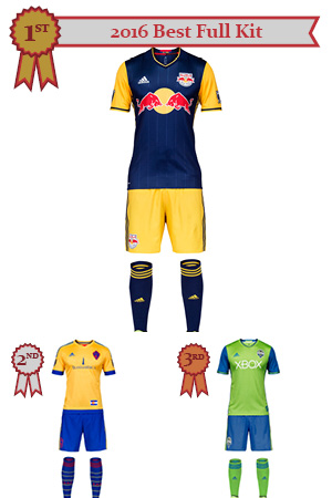
- Red Bulls away. In addition to having a weakness for stripes, is also a weakness for different coloured sleeves. And as much as the energy drink branding is a bit overkill, denying the pallet that New York has to work with would be a disservice. Yellow sleeves, blue body, yellow shorts, blue socks. That’s a complete kit that means business.
- Colorado away. A great top matched with simple shorts. Still not sure what could’ve been done with that badge, but given that this is inspired by the state flag, red has to be fit in somewhere. What could’ve made this kit a gold medal were the socks. Yellow and blue striped socks or, dare to dream, yellow, blue and red socks(!?!). OK, that could’ve been a bit much.
- Seattle home. Some people are annoyed by Seattle’s colours (or their team, or their supporters) but I am not one of them. Their lime green and their darker-than-royal-but-not-too-dark blue look smashing together. Similar layout as the Red Bulls, just swap the colours.
Fun fact (Is it “fun”? ~ Ed.) : Same three teams as last year, with Red Bulls and Colorado swapping places.
2016 Best Looking Team
Criteria : Home or away, they look good. Talent within the kits is optional.
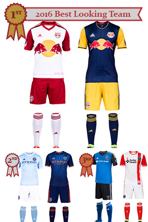
- Red Bulls. Already declared how nice the away kit is, the home kit is also solid. The contrast between the two is evident, and though sponsors usually hinder a kit, Red Bull branding makes it better and they do it in a way that it looks less like a sponsor and more like a logo in the middle of the shirt (this may be my hockey jersey sensibilities talking). They’re the only club that can pull this off.
- NYCFC. Though separately they’re nothing that good, together… it’s not so bad. To be fair, many teams had a “one nice kit/one less than nice kit” combination, but these to medium-nice-ish kits make for a silver medal. Good contrast between home and away, and though the circles on the away shirt is annoying, as a whole package it’s pretty sweet.
- San Jose. Two slightly above ordinary kits equals bronze*. First off, the different colour sleeves always had my favour. Secondly, the strange but subtle zipper pattern into the fabric of the home shirt and the solid single red stripe (also with zipper pattern) on the away kit gave this duo enough personality to get onto this list. Could’ve had silver but that stupid SJ74 “jock tag” on the away kit hurts my intellect.
* I’m fully aware that gave this tandem worst pair last season, but I’ve softened my stance on the home kit and I don’t hate the away kit, likely because the sponsor gives it some personality
2016 Worst Jersey
Criteria : Ugly, embarrassing, something you’d gift to someone you do not like (which begs the question of why you’d gift it at all).
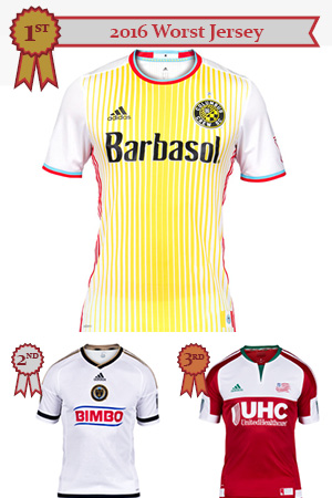
- Columbus away. I don’t know who the audience is and whoever approved of this should be publicly named so they could never be referenced for an opinion on taste. Why are there 5 colours on this kit?!?!
- Philadelphia away. This just feels like they stopped trying. Or caring. And the dark blue is too dark. It looks like black, which wouldn’t be bad except that I know it’s supposed to be blue.
- New England away. I know what you were trying to do here. I do. I get it. But it all feels like a throw-away. I don’t know if it’s the giant white shoulder-to-armpit space where the logos float. I don’t know if it’s the underuse of green. It’s just underwhelming given that it was supposed to identify with New England. Green cuffs or green stripes with white cuffs? Maybe a green band where the sponsor is? It means well, but meh.
2016 Worst Full Kit
Criteria : In a league where everyone has bespoke uniforms, you should not have ugly uniforms – and, yet, here they are.
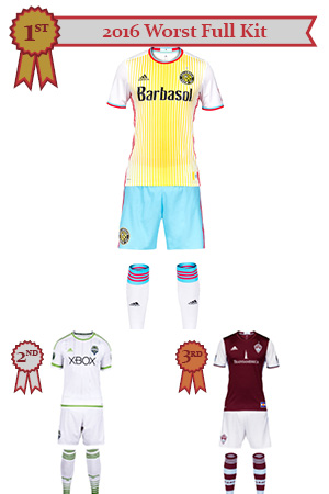
- Columbus away. I don’t know who the audience is and whoever approved of this should be publicly named so they could never be referenced for an opinion on taste. I will say that I do weirdly like the shorts (sky blue and red… why not?), but the crest ruins it. Why are there 5 colours on this kit?!?!
- Seattle away. Yeah, there’s embossed stripes but this is boring. I think a quick fix shoulda coulda woulda been making the sponsor blue, or green with blue trim (instead of the green). It’s not terrible, but it’s not good and it’s not worth the price of a kit ever.
- Colorado home. Picking a third worst was tough because past the first two (which were dead obvious to me), so I’m going to nitpick. The difference between Colorado being on and off this list is the light blue trim. It’s not very flattering. It looks washed out and almost a mistake. If the sky blue was a little richer in tone (think West Ham or Burnley or Villa or…), this would be stellar, but I am very hung up on it. The socks look wrong and I adore hoopy socks.
2016 Worst Looking Team
Criteria : Someone has to be the worst. Uninspired, awkward looks no matter where you play.
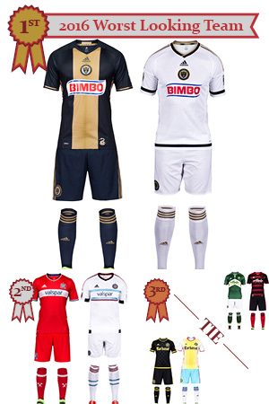
- Philadelphia. Made changes and got worse and it has to do with shade. I know they’re a navy team. Everyone who follows this league knows that they’re a navy team. But that’s damn near black. Just steal New England’s navy. Or get a new shade. I don’t hate the snake skin pattern in the bib, but… *exhale*. I’ve already spilled my thoughts on the bad away kit.
- Chicago. I just feel like this is lame. This looks like a team that were promoted last season and will get the drop this season (and we’re not even talking about how they played, hey-ooo!). Uninspiring. Ordinary. And can we use a bit more of that light blue (psst! Colorado, like this!). Just steal the Chicago Red Stars (http://chicagoredstars.com/) home kit and make it your away. You’re welcome.
- Portland / Columbus (tie). Like the previous bronze medalist, it is not an issue that they were bad, but someone has to be in this position. With Columbus, I do like the black kit and though I’m sorely disappointed with the removal of the yellow kit, it’s replacement was… well… you know how I feel. With Portland, I’m over the chevron on the home kit and was never that crazy about the hoop/gradient thing on the away kit, plus that sponsor is ugly and does you no favours. When it came down to it, I couldn’t decide who was worse so they both win.
Well that’s another one in the books. Who could’ve saw the surprise with Columbus? Shockwaves felt all around the kit nerd world. Thank you for joining us for the 2016 Kitties here at the Vocal Minority. Throw in your two bits down below. Good night and drive safe!